Responsive design
Describes an overview of responsive design in Optimizely Configured Commerce.
Responsive Webpages
Responsive Webpages are webpages designed to change their presentation and orientation depending on the type of device viewing the webpage. This means you can have a single webpage that displays differently on a smartphone, a tablet, and a desktop computer.
This presentation of page elements is designed to optimize the screen size of the device type displaying the website, while still maintaining the functionality of the website elements. This is accomplished by having a single underlying layer of HTML coding with sets of CSS that adjust based on the device's screen size or window size.
There are three specific breakpoints where the presentation changes:
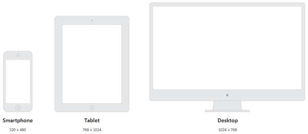
- Smartphone: 320px
- Tablet: 768px
- Desktop: 1024px
This means that a website displayed on a window sized at 769 pixels will display in the layout of the full desktop site, where website displayed on a window sized at 767 pixels will show as the tablet optimized version.
Mobile webpages
Mobile webpages and responsive webpages both aim to optimize the website user experience based on the type of device on which the website is viewed. The table below discusses the considerations for both mobile and responsive web pages:
| Consideration | Mobile Webpage | Responsive Webpage |
|---|---|---|
| URL | Mobile Webpages often use a separate site (usually a subdomain) that depends on HTML redirection to ensure users are routed to the correct website | Responsive Webpages all use the same URL, as it is all coded into the page |
| Rendering | Mobile Webpages are statically set to a certain, optimized mobile screen size | Responsive Webpages change the webpage presentation and orientation on the fly |
| Content | As a Mobile Webpage is a completely different website, you can tailor content specifically to mobile users | Content can be targeted to specific devices - Desktop, Tablet or Phone. This ensures content can be customized to fit the device size and format. |
Updated 5 months ago