
Configure form element types
Configure default form element types in Optimizely CMS 13. Customize text, number, date, range, selection, file upload, and CAPTCHA elements with validators and dependencies.
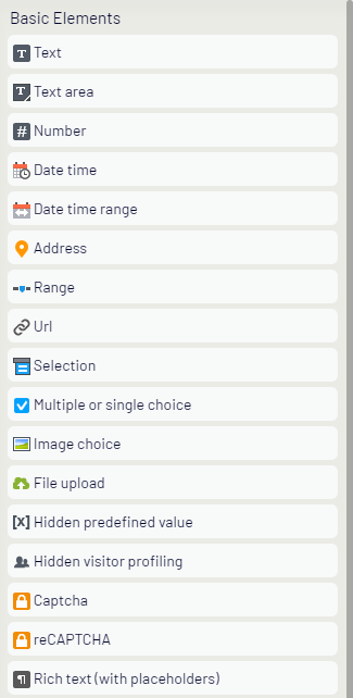
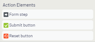
Optimizely provides default form element types that you modify to build reusable form element instances. The Forms gadget lists Basic and Action elements. For example, drag a Text form element type onto a page and edit the instance to create a username text field, or an email address text field with required validation. See Configure a form element for details.
Basic elements
Action elements
The following Basic element types are predefined in Optimizely Forms:
Text
The Text element creates a single-line text entry field. Restrict the format to email addresses or date formats as needed.

Text element, Content tab:
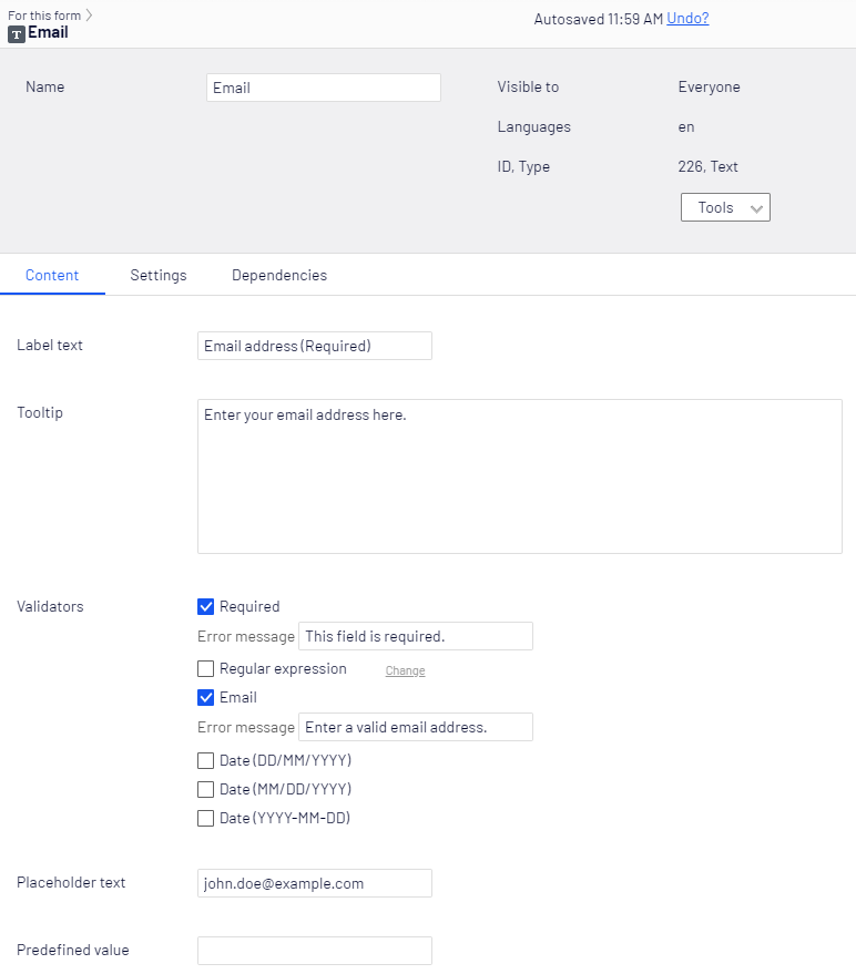
The Text form element has the following properties:
-
Label text – Enter the text to display on the form.
-
Tooltip – Enter the text to display when a visitor hovers over the text field.
-
Validators – The following predefined validators are available:
- Required – The visitor must fill in the text field before submitting the form.
- Regular Expression – Click Change to enter a regular expression pattern (such as /\s*/).
- Email – Validates that the text field contains a properly formatted email address.
Optimizely Forms validates that dates in the text field conform to a specific format. Choose one of the following date formats:
- Date (DD/MM/YYYY)
- Date (MM/DD/YYYY)
- Date (YYYY-MM-DD)
Configure the error message displayed to the visitor for each validator if validation fails.
-
Placeholder text – Enter text to display in the field as a prompt. The placeholder is not recorded in the data and is replaced by visitor input.
-
Predefined value – Enter a value to display and record as the default text. The visitor's entry overwrites this text. When both Placeholder text and Predefined value are specified, Predefined value displays and overrides Placeholder text.
Text area
The Text area element creates a multiple-line text entry field. Use it for longer responses such as comments or cover letters.
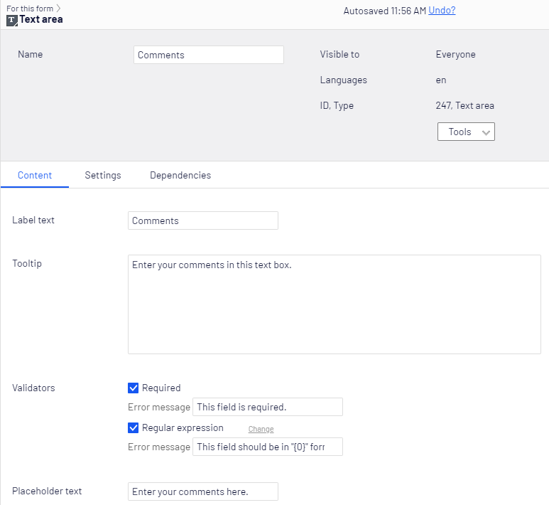
- Label text – Enter the text to display on the form.
- Tooltip – Enter the text to display when a visitor hovers over the text field.
- Validators – The following predefined validators are available:
- Required – The visitor must fill in the text field before submitting the form.
- Regular Expression – Click Change to enter a regular expression pattern (such as /\s*/). Configure the error message displayed to the visitor for each validator if validation fails.
- Placeholder text – Enter text to display in the field as a prompt. The placeholder is not recorded in the data and is replaced by visitor input.
See the Dependencies tab section.
Number
The Number element restricts visitor input to a numeric value. Use it for fields such as a Quantity of items to purchase.
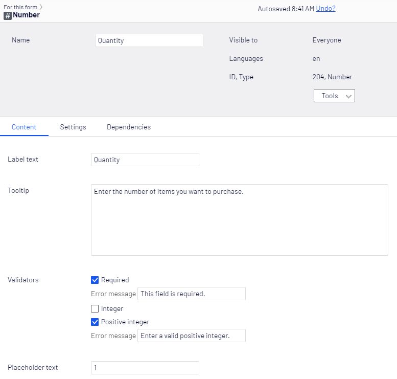
- Label text – Enter the text to display on the form.
- Tooltip – Enter the text to display when a visitor hovers over the number field.
- Validators – Select one or more number restrictions:
- Required – The visitor must enter a value before submitting the form. Clear the checkbox to make the field optional.
- Integer – Select the checkbox to require any integer value.
- Positive integer – Select the checkbox to require a positive integer value. Configure the error message displayed to the visitor for each validator if validation fails.
- Placeholder text – Enter text to display in the field as a prompt. The placeholder is not recorded in the data and is replaced by visitor input.
See the Dependencies tab section.
Date time
The Date time element creates a date and time picker where a visitor selects a date from a calendar and sets the time.
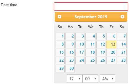
NoteThe Optimizely Forms Samples package must be installed for Date time to work. See Optimizely Forms Samples package for information.
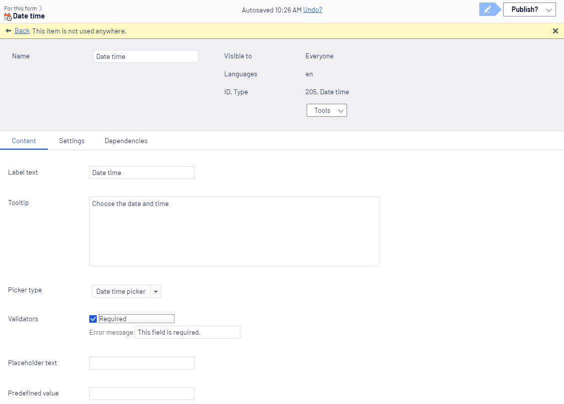
- Label text – Enter the text to display on the form for the Date time field.
- Tooltip – Enter the text to display when a visitor hovers over the Date time field.
- Picker type – Select Date picker, Time picker, or Date time picker.
- Validators – The following predefined validator is available:
- Required – Select the Required checkbox to require a value before submission. Clear the checkbox to make the field optional. Configure the error message displayed to the visitor if validation fails.
- Placeholder text – Enter the date or time to display in the field as a prompt. The placeholder is not recorded in the data and is replaced by visitor input.
- Predefined value – Enter a date, time, or both to display and record as the default value. The visitor's entry overwrites this value. When both Placeholder text and Predefined value are specified, Predefined value displays and overrides Placeholder text.
Range
The Range element lets a visitor specify a numeric value within a defined range. The default range is 0 to 10. Adjust the range with the Min and Max values.

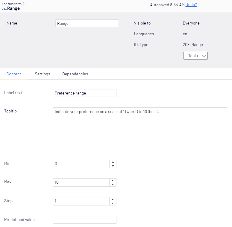
- Label text – Enter the text to display on the form.
- Tooltip – Enter the text to display when a visitor hovers over the Range field.
- Min – Enter the minimum range value (down to -2,147,483,648).
- Max – Enter the maximum range value (up to 2,147,483,647).
- Step – Enter the increment (1 to 2147483648) between the minimum and maximum values. For example, specify 3 for a range of 1 to 100 that steps by 3 (1, 4, 7, 10, 13, and so on).
- Predefined value – Enter a value to display and record as the default range selection (such as the middle of the range).
See the Dependencies tab section.
URL
The URL element lets a visitor specify a URL to submit with form data.
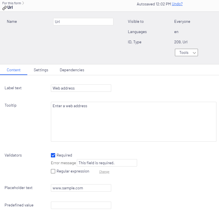
- Label text – Enter the text to display on the form.
- Tooltip – Enter the text to display when a visitor hovers over the URL field.
- Validators – Select one or more restrictions:
- Required – Select the Required checkbox to require a value before submission. Clear the checkbox to make the field optional.
- Regular expression – Click Change to enter a regular expression pattern (such as /\s*/). Configure the error message displayed to the visitor for each validator if validation fails.
- Placeholder text – Enter the URL to display in the field as a prompt. The placeholder is not recorded in the data and is replaced by visitor input.
- Predefined value – Enter a URL to display and record as the default text. The visitor's entry overwrites this text. When both Placeholder text and Predefined value are specified, Predefined value displays and overrides Placeholder text.
See the Dependencies tab section.
Selection
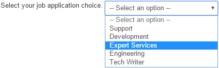
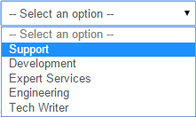
The Selection element creates a drop-down list with single or multiple selections. Use it to present a predefined set of options to visitors.
-
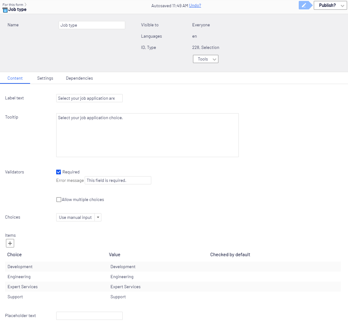
Label text – Enter the text to display on the form.
-
Tooltip – Enter the text to display when a visitor hovers over the selection field.
-
Validators – The following predefined validators are available:
-
Required – Select to require a choice before submission. Clear the checkbox to make the field optional. Configure the error message displayed to the visitor if validation fails.
-
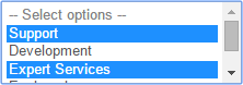
Allow multiple choices:
-
Select the checkbox for multiple selections.
-
Clear the checkbox for single-choice selection.
-
-
-
Choices – Use manual input
Select this option to display an Add list item icon (+). Click it to open the Item Details page:
-
Choice – Enter the text to display. For example, Chocolate.
-
Value – Enter the value (not displayed) to use in your reports (such as Chocolate).
-
Checked by default – Enable to pre-select the list item, such as Vanilla.
NoteSelect multiple default items for multiple selections but only one item when Allow multiple select is disabled.
-
-
Placeholder text – Enter text to display in the field as a prompt. The placeholder is not recorded in the data and is replaced by visitor input.
See the Dependencies tab section.
Multiple or single-choice
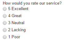
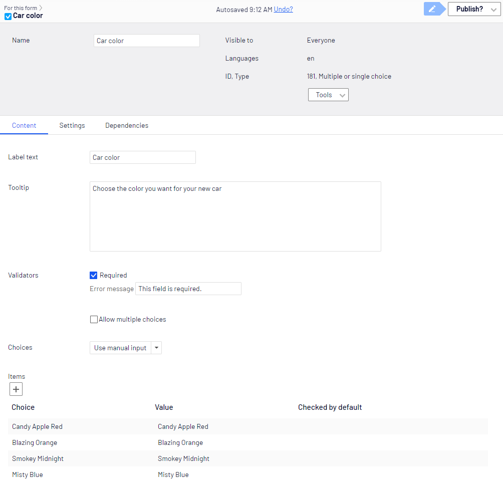
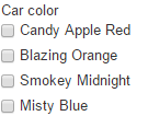
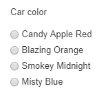
The Multiple or single-choice element creates a list of single-choice radio buttons or multiple-choice checkboxes. Use it when visitors need to select from visible options.
-
Label text – Enter the text to display on the form.
-
Tooltip – Enter the text to display when a visitor hovers over the choice field.
-
Validators – The following predefined validators are available:
-
Required – Select the checkbox to require a choice before submission. Clear the checkbox to make the field optional.
-
Allow multiple choices:
-
Select the checkbox for multiple-choice checkboxes.
-
Clear the checkbox for single-choice radio buttons.
-
Configure the error message displayed to the visitor for each validator if validation fails.
-
-
Choices – Use manual input
Click Add item (+). The Item Details page displays. Configure the following fields:
-
Choice – Enter the text to display. For example, Same-day shipping.
-
Value – Enter the value (not displayed) to use in your reports (such as FedEx).
-
Checked by default – Enable to pre-select the list item.
NoteSelect multiple default items for checkboxes but only one for radio buttons.
-
See the Dependencies tab section.
Image choice
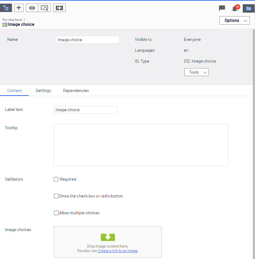
The Image choice element lets a visitor select one or more images from an image list. Use it for visual surveys or product selection forms.
-
Label text – Enter the text to display on the form.
-
Tooltip – Enter the text to display when a visitor hovers over the image field.
-
Validators – The following predefined validators are available:
- Required – Select the checkbox to require a choice before submission. Clear the checkbox to make the field optional.
- Show the checkbox or radio button – Select to show a checkbox (multiple choice) or radio button (single choice) next to the image selections. Clear the checkbox to hide the input control.
- Allow multiple choices – Select the checkbox to let visitors select more than one image. Clear the checkbox to allow only one image selection. Configure the error message displayed to the visitor for each validator if validation fails.
-
Image choices – Drag image media items into this area.
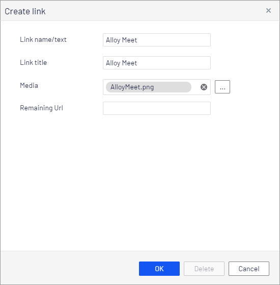
Click Create a link to an image to select one from the content tree and assign a title.
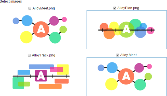
The visitor chooses from the available images. Use borderless images for optimal display.
See the Dependencies tab section.
File upload
The File upload element lets a visitor upload a file by selecting it from a file browser. Restrict the size and types of files visitors upload.
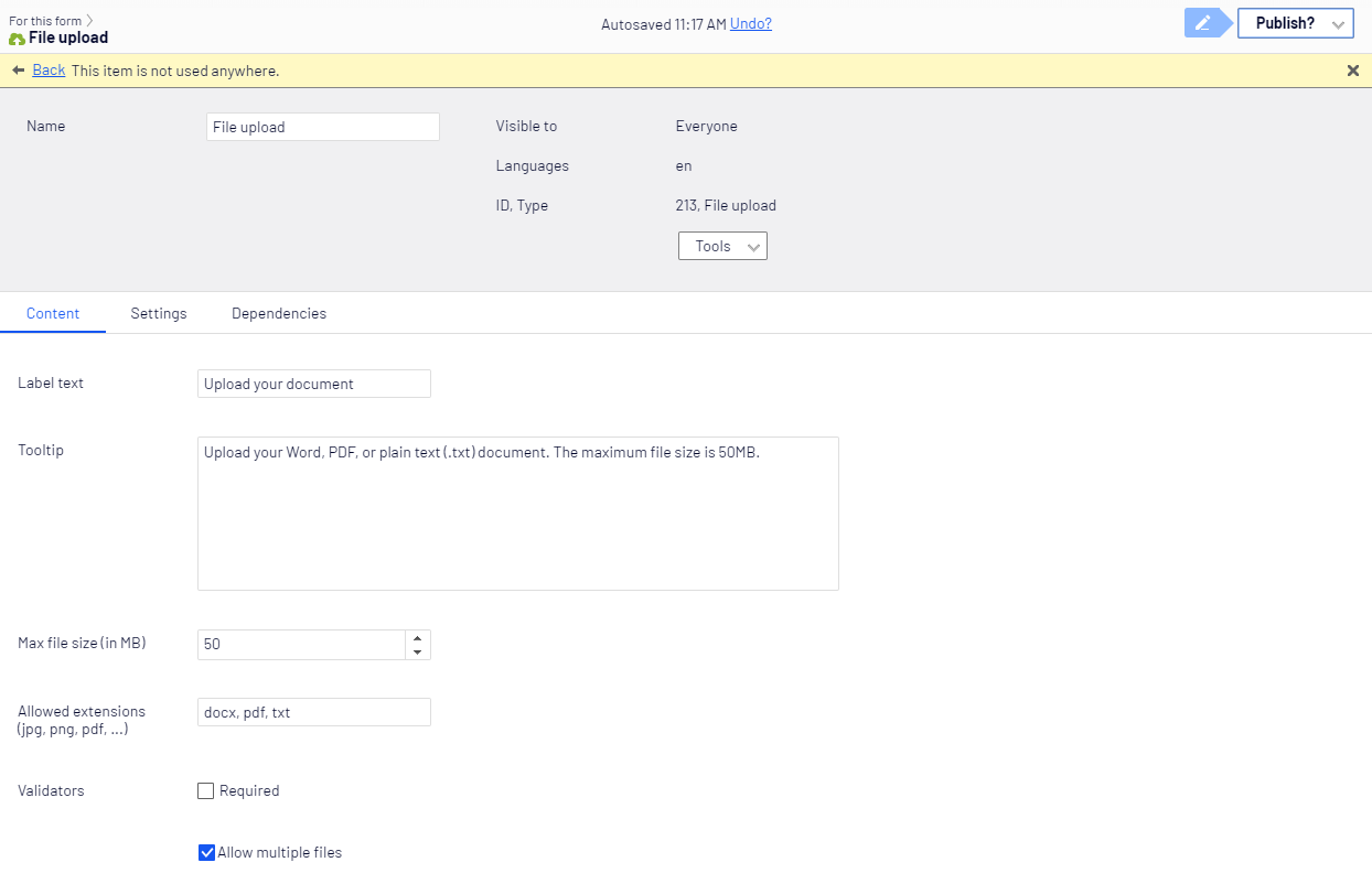
- Label text – Enter the text to display on the form.
- Tooltip – Enter the text to display when a visitor hovers over the upload field.
- Max file size (in MB) – Select the maximum file size (in MB).
- Allowed extensions – Specify a comma-separated list of permitted file extensions. To configure the default list of restricted file extensions, see Configure forms in the Optimizely Forms Developer Guide.
- Validators – Select the Required checkbox to require a file before submission. Clear the checkbox to make the field optional. Configure the error message displayed to the visitor if validation fails.
See the Dependencies tab section.
Hidden predefined value
The Hidden predefined value element lets you tag submitted form data with an internal identifier. For example, enter Christmas-campaign in one form and Hanukkah-campaign in another to associate submissions with a specific marketing campaign.
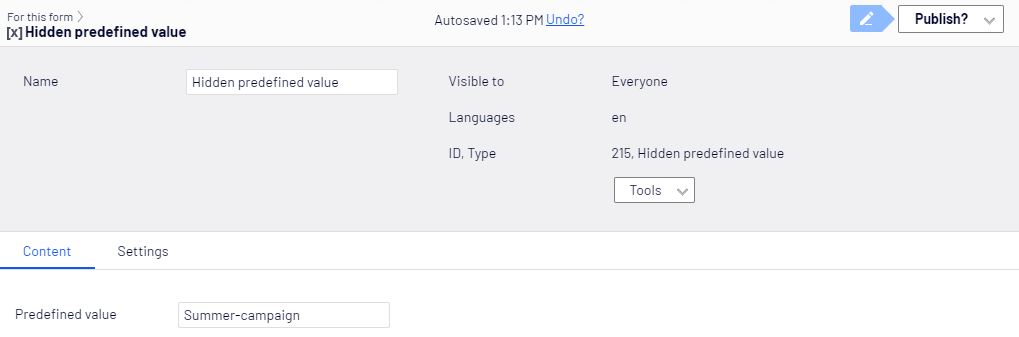
- Predefined value – Enter the value to identify the data source.
Hidden visitor profiling
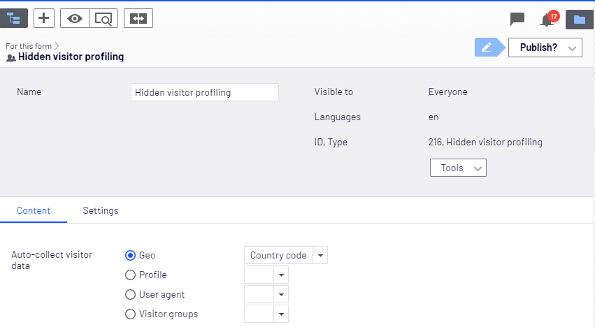
The Hidden visitor profiling element collects data about the visitor (such as geography, profile, user agent, or visitor group) without displaying on the form.
-
Auto-collect visitor data – Select one data type to collect. To collect multiple data types (such as latitude and longitude), add two Hidden visitor profiling form elements and configure each for a different data type.
The following data type categories are available:
- Geo – Tracks geographical data from the visitor's device, such as IP address, time zone, latitude, or longitude. This data is typically in a numeric format.
- Profile – Tracks visitor profile data, such as address, company, and so on. This data is typically in plain text.
- User agent – Is mobile detects if the visitor uses a mobile device. User agents tracks the visitor's browser type and version.
- Visitor groups – The Name data type tracks whether the visitor belongs to one or more visitor groups.
CAPTCHA
The CAPTCHA element verifies that the person filling in your form is not a machine. The visitor enters a code that only humans interpret.

NoteFor forms used by visually impaired people, consider using reCAPTCHA instead.
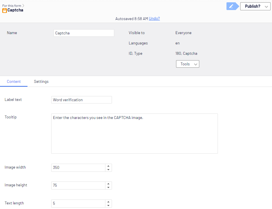
- Label text – Enter the text displayed on the form (such as Word Verification).
- Tooltip – Enter the text to display when a visitor hovers over the CAPTCHA image.
- Image width – Set the width of the CAPTCHA image (100 to 350 pixels).
- Image height – Set the height of the CAPTCHA image (21 to 75 pixels).
- Text length – Set the number of characters for the CAPTCHA code (5 to 10).
reCAPTCHA
The reCAPTCHA element verifies that the person filling in your form is not a machine. reCAPTCHA uses a single checkbox that only humans complete.
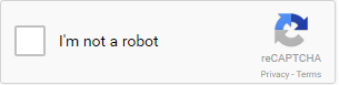
NoteThe Optimizely Forms Samples package must be installed for reCAPTCHA to work. See Optimizely Forms Samples package for information.
The reCAPTCHA form element adds JavaScript code to your HTML for reCAPTCHA to function. It follows the Automatically render the reCAPTCHA widget instructions on the Google developer website.
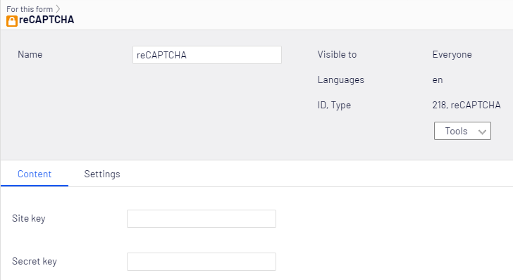
- Site key – Enter a valid site key.
- Secret key – Enter a secret key.
Rich text (with placeholders)
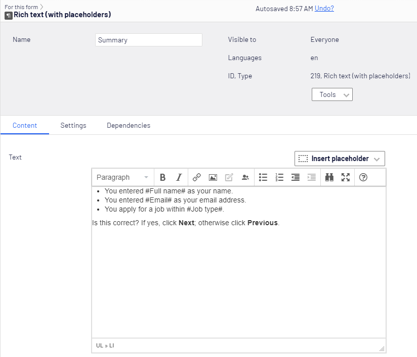
The Rich text element lets you format text and use form data to display customized text to the visitor. Use it to show confirmation messages or personalized content within multi-step forms.
NotePlaceholders in rich text elements work only in forms with multiple form steps. Place the rich text element after the fields from which you want to retrieve data.
-
Content tab
- Text – Enter the text to display in the block on the form.
- Insert placeholder – Select one or more placeholders to insert into your text. Customize the text with a visitor's name, email, or other data.
-
Settings tab
-
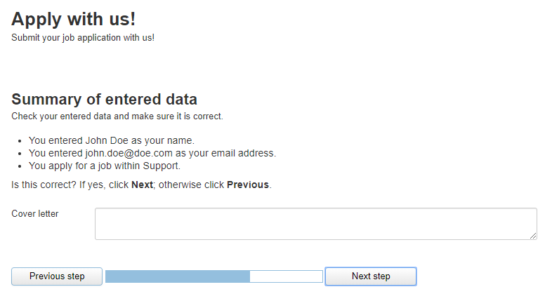
Disable placeholders replacement – Replacing placeholders with visitor data may cause performance issues. Select Disable placeholders replacement to display the default placeholder text instead of the visitor's entered data.
Example:
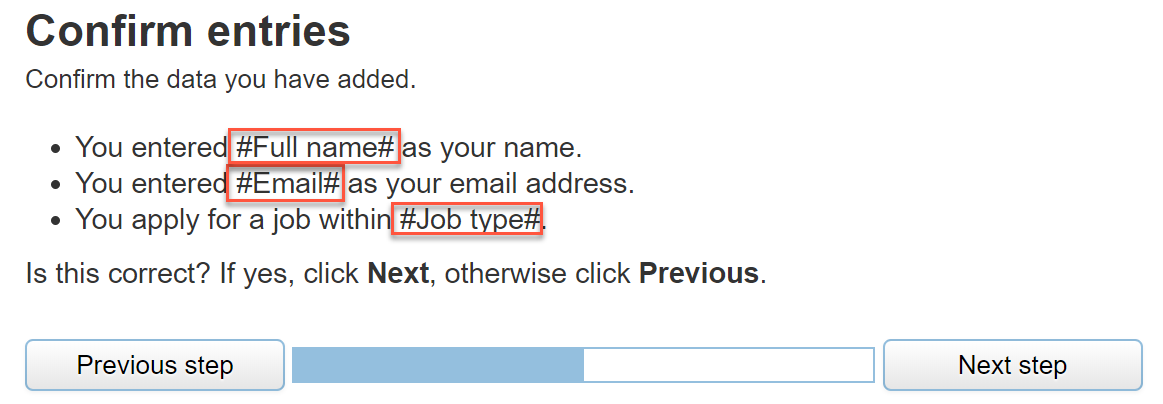
A visitor applies for a job and enters their name, email address, and job type.
When Disable placeholders replacement is selected, the original placeholder text displays instead of the visitor's data in the rich text element:
-
See the Dependencies tab section.
Form step
The Form step element separates a form into steps. Place a Form step element before the content for each step. Conditionalize whether a visitor sees a step on the Settings tab. For example, configure a form so that visitors who select option A in step 1 see step 2, while visitors who select option B see step 3.
Content tab
Assign the form step a label and a description on the Content tab.
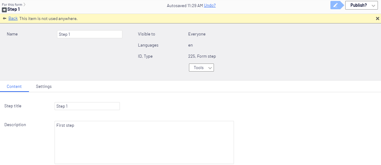
- Label text – Enter the text to display on the form.
- Description – Enter the text to display when a visitor hovers over the form step.
Settings tab
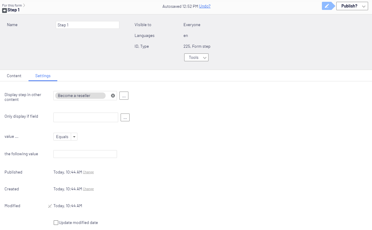
Define the rules that control when a Form step displays. For example, Number field equals 4 or Color choice not contains gray.
-
Display step in other content – Click Browse (...) to select a page on which this step displays. For example, display one step on a page for engineering job applicants and another step on a page for other applicants. Click Delete to clear the page selection. Click OK to confirm your selection.
-
Only display if field – Click Browse (...) to select an element from a previous step on which this element depends. For example, display this element only when the visitor supplied a telephone number in the previous step.
-
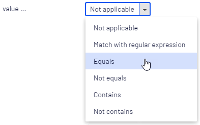
value... – Select a condition operator:
-
Not Applicable
-
Match with Regular Expression
-
Equals
-
Not Equals
-
Contains
-
Not Contains
-
-
the following value – Set the value against which the condition applies.
-
Published, Created, Modified, Update modified date – These are system-generated timestamps for the content. Select the Update modified date checkbox when you make significant changes and want Optimizely to update the modification date.
Submit button
The Submit button element lets a visitor send form data to Optimizely CMS.
Content tab
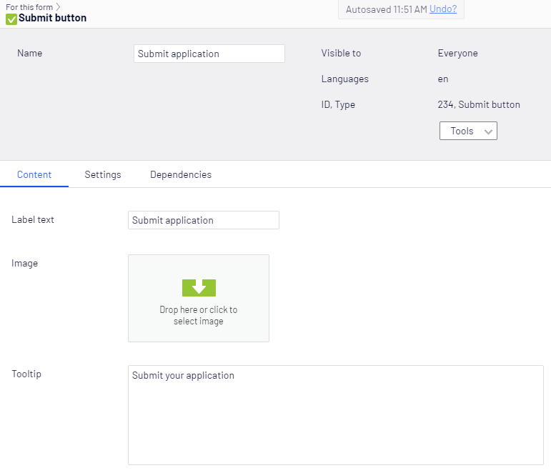
- Label text – Enter the text to display on the form.
- Image – Select an image to use as the submit control.
- Tooltip – Enter the text to display when a visitor hovers over Submit.
Settings tab
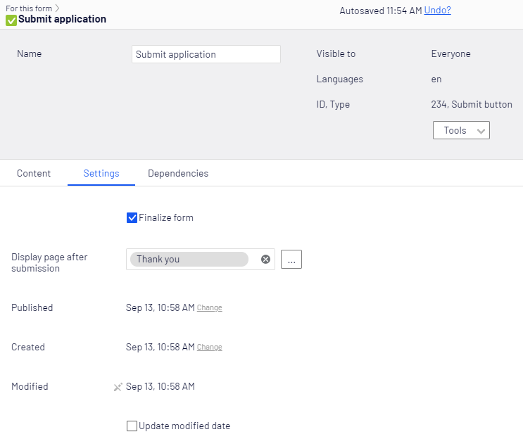
- Finalize form – Select this checkbox to let visitors finalize a multi-step form without completing all steps. For example, when a form contains four steps and the last two are optional, visitors submit a finalized form at step 2. Clear the checkbox to require visitors to complete all steps.
- Display page after submission – Select a page to display after the visitor clicks Submit.
See the Dependencies tab section.
Reset button
The Reset button element lets a visitor clear the form contents.
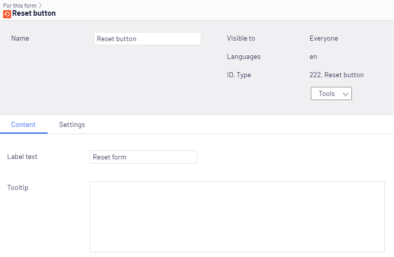
- Label text – Enter the text to display on the form.
- Tooltip – Enter the text to display when a visitor hovers over Reset.
Settings tab
The Settings tab lets you edit the Created and Published dates of form elements. The Submit button and Form step types have additional settings on this tab. See their respective sections for details.
Dependencies tab
The Dependencies tab applies to the following form elements: Image Choice, Number, Range, Selection, Text area, Text, URL, File upload, Multiple or single choice, Rich text, and the Submit button.
Use the Dependencies tab to show or hide a form element based on how the visitor interacts with another element. For example, create a form question How do you rate our services from 1 to 5?, and display a follow-up question when the visitor gives a rating of 1 or 2.
Define one or more conditions. When the specified conditions are met, the form element displays or hides. See Example: Create a customer satisfaction survey for an example of creating dependent form fields.
-
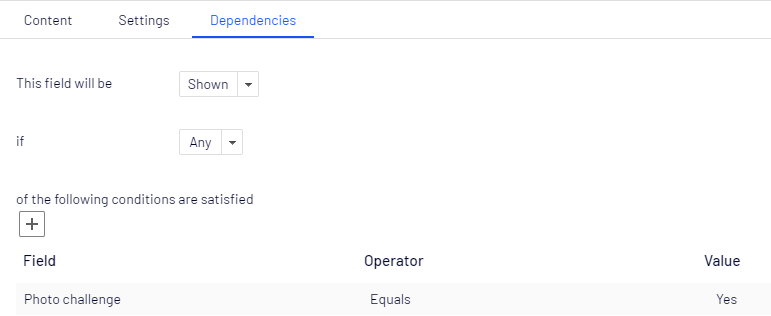
This field will be – Select Shown to display the form element when conditions are met, or select Hidden to hide it when conditions are met.
-
if – Select whether to show or hide the element when all or any specified conditions are met.
-
of the following conditions are satisfied: – Specify which form field the current element depends on and the conditions that must be met. Define multiple conditions as needed.
-
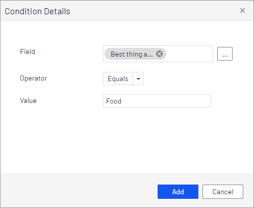
Click + to open the Condition Details dialog box.
-
Select the form element that the current element depends on under Field by clicking Browse.
-
Select one of the following conditions under Condition:
- Match with regular expression
- Equals
- Not equals
- Contains
- Not contains
-
Define the value the condition applies to under Value.
Example: Display a form field when a visitor rates a service as 1 or 2 on a scale to 5
Set This field will be to Shown if Any of the following conditions are satisfied: Service rating Equals 1 and Service rating Equals 2.
-
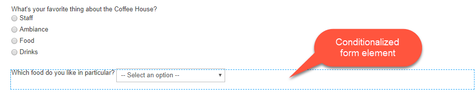
When a form element has conditions, a thin blue dotted border marks it:
Updated 2 months ago