Block property
Explore block properties in Optimizely CMS 13. Learn how to define, manage, and use blocks to build flexible and reusable content components.
The Block property type lets you embed structured, reusable content components within a content type. Use blocks to group related properties and create modular content structures. Define your own block types through Create pages and blocks.
The following image shows Block property type examples.
Configure Block property
The following attributes are available when you configure a Block property.
-
Name – Enter the name of this block property type. This name is used for programming and language settings.
-
Type – Lets you change the content type to any other.
-
Block Type – Select any of the existing block content types to create a block with separate properties. (To create a block, see Create pages and blocks.)
-
Value must be entered – Unavailable.
-
Unique value per language – Unavailable.
-
List – Select to make the property a list property. Available in Experience and Element content types; unavailable in Page, Block, and Media content types.
-
Property Indexing Type – Unavailable.
-
Default value – Unavailable.
-
Display in edit view – Unavailable.
-
Display name – Enter the text you want to display above the block element on the page in All Properties view.
-
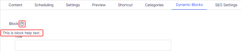
Help text – Enter text to display next to the Display Name. The following image shows how help text displays.
-
Sort index – Specify a value to determine the order in which data is displayed or processed.
-
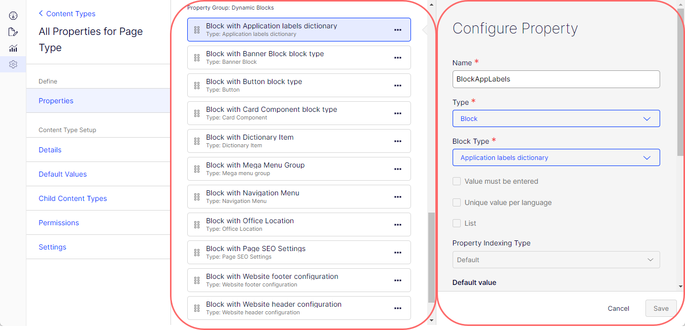
Property Group – Select a property group (Categories, Content, Dynamic Blocks, Preview, Scheduling, SEO Settings, Shortcut) to organize your content on tabs in the All Properties view of the content type. The following image shows a block on the Dynamic Blocks tab (property group).
How block property types render in the All Properties view
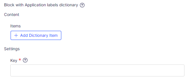
Application labels dictionary
The Application labels dictionary content type has the following property components.
- Items – Dictionary item block type.
- Key – Simple text box.
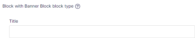
Banner Block
The Banner Block content type has the following property component.
- Title – Simple text box.
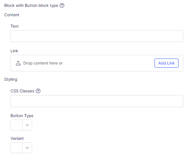
Button
The Button content type has the following property components.
- Link – URL to page or external address.
- Text – Simple text box.
- CSS Classes – Simple text box.
- Button Type – Choice (drop-down list).
- Variant – Choice (drop-down list).
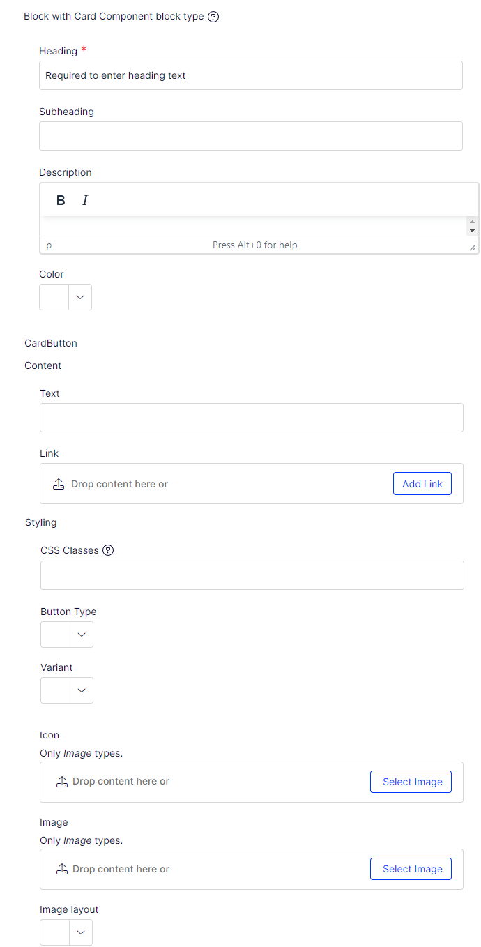
Card Component
The Card Component content type has the following property components.
- Heading – Simple text box that requires input.
- Subheading – Simple text box.
- Description – Text box with minimal TinyMCE (bold and italics only).
- Color – Choice (drop-down list).
- CardButton – Button block type.
- Icon – Content Reference with only images allowed.
- Image – Content Reference with only images allowed.
- Image Layout – Choice (drop-down list).
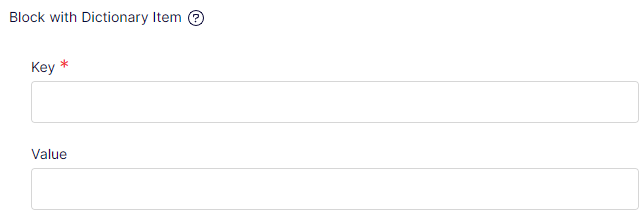
Dictionary Item
The Dictionary Item content type has the following property components.
- Key – Simple text box.
- Value – Simple text box.
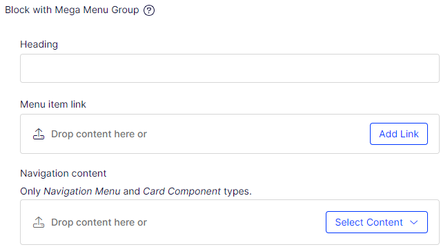
Mega Menu Group
The Mega Menu Group content type has the following property components.
- Heading – Simple text box.
- Menu item link – URL to page or external address.
- Navigation content – Content Area with allowed content types: Navigation Menu and Card Component.
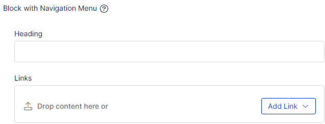
Navigation Menu
The Navigation Menu content type has the following property components.
- Heading – Simple text box.
- Links – Link collection.
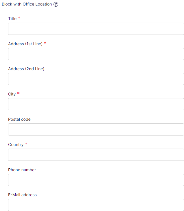
Office locations
The Office locations content type has the following property components.
- Title – Simple text box. User is required to enter data.
- Address (1st Line) – Simple text box. User is required to enter data.
- Address (2nd Line) – Simple text box.
- City – Simple text box. User is required to enter data.
- Postal Code – Simple text box.
- Country – Simple text box.
- Phone number – Simple text box.
- E-Mail address – Simple text box.
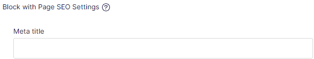
Page SEO Settings
The Page SEO Settings content type has the following property component.
- Meta title – Simple text box.
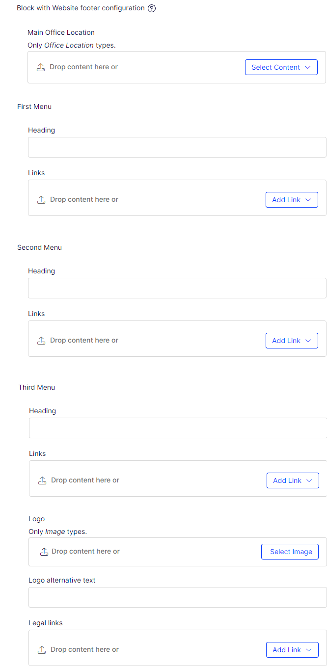
Website footer configuration
The Website footer configuration content type has the following property components.
- Main Office Location – Content Area that permits only an Office Location content type as input.
- First Menu – Navigation Menu block type.
- Second Menu – Navigation Menu block type.
- Third Menu – Navigation Menu block type.
- Logo – Content Reference that permits only an Images content type as input.
- Logo alternative text – Simple text box.
- Legal links – Link collection.
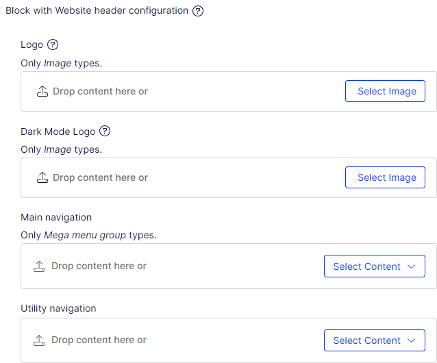
Website header configuration
The Website header configuration content type has the following property components.
- Logo – Content Reference that permits only an Images content type as input.
- Dark Mode Logo – Content Reference that permits only an Images content type as input.
- Main Navigation – Content Area that permits only a Mega menu group content type as input.
- Utility Navigation – Content Area.
Block property binding in Visual Builder
Block properties support property binding in the Visual Builder view. Binding connects a block property directly to a property on the parent Experience or Section, letting editors manage the value from the parent content item rather than editing the block in isolation.
NoteBinding is available only for properties on blocks that are direct children of an Experience or Section (first-level content). Nested scenarios — where a block is placed inside another block, which is itself inside an Experience or Section — are not supported.