Preview Visual Builder content
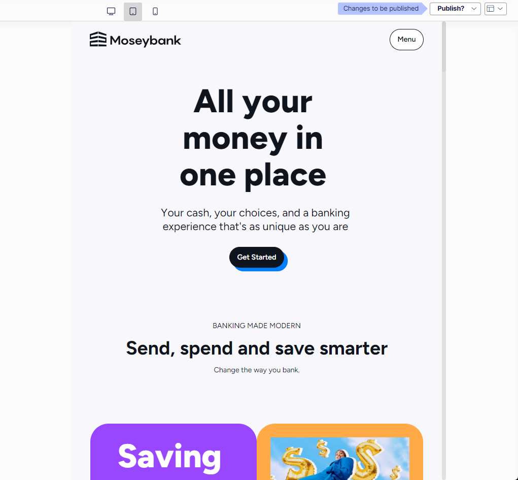
Preview Optimizely Visual Builder content across desktop, tablet, and mobile views. Adjust panel sizes and interact with the outline and preview panels.
Preview your Visual Builder content to verify layout, styling, and responsiveness before publishing. The preview panel displays the experience as you build it. It can display any content for any channel. Visual Builder integrates the Outline and Preview panels so that hovering over a section in the Outline panel also highlights the corresponding section in the Preview panel and vice versa.
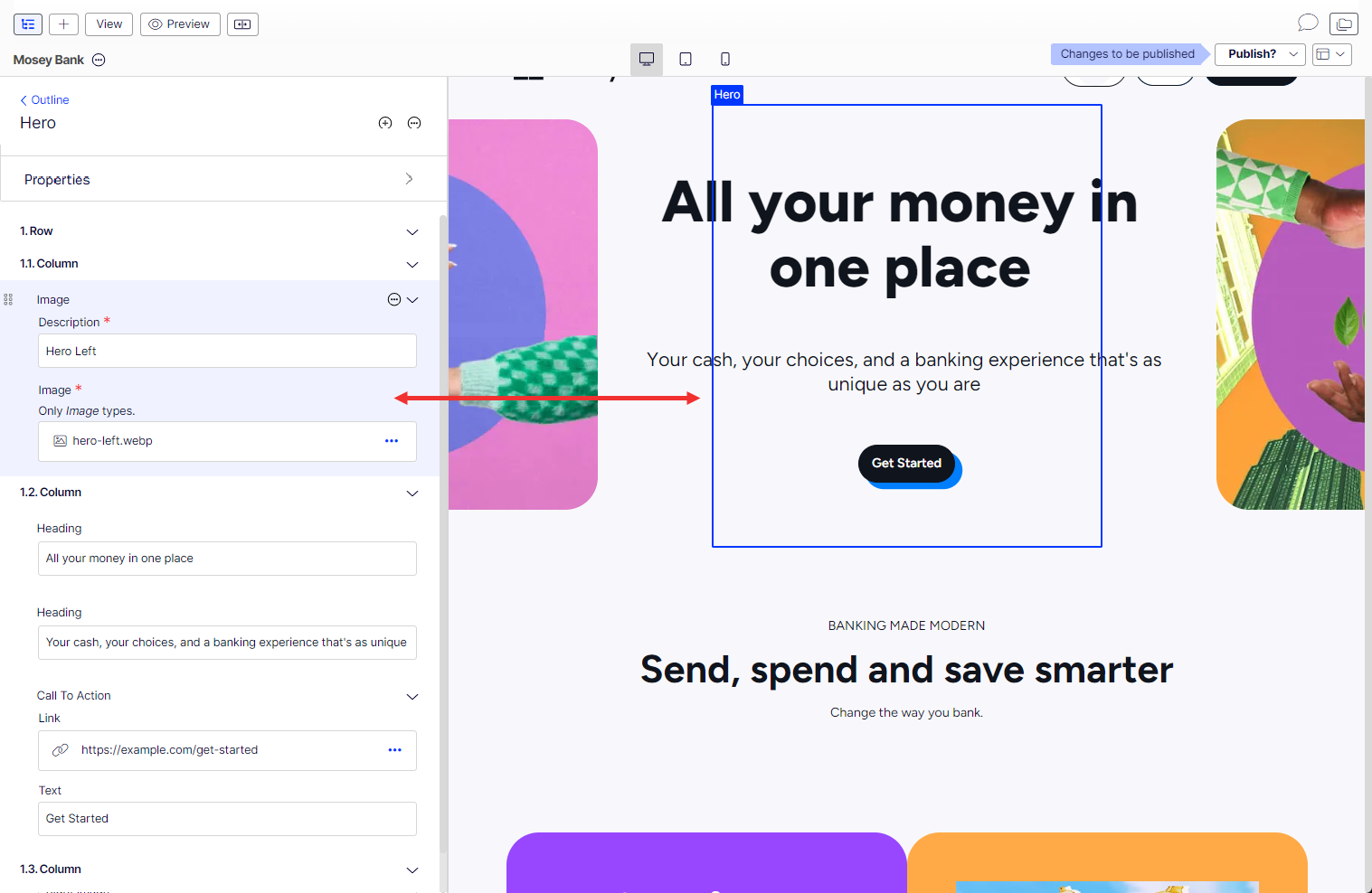
When you click an element in the Preview panel, the section opens in the Outline panel for you to work on.
Adjust panel size
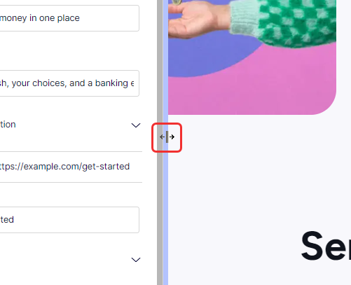
Drag the vertical bar between the panels to resize them and create more editing space.
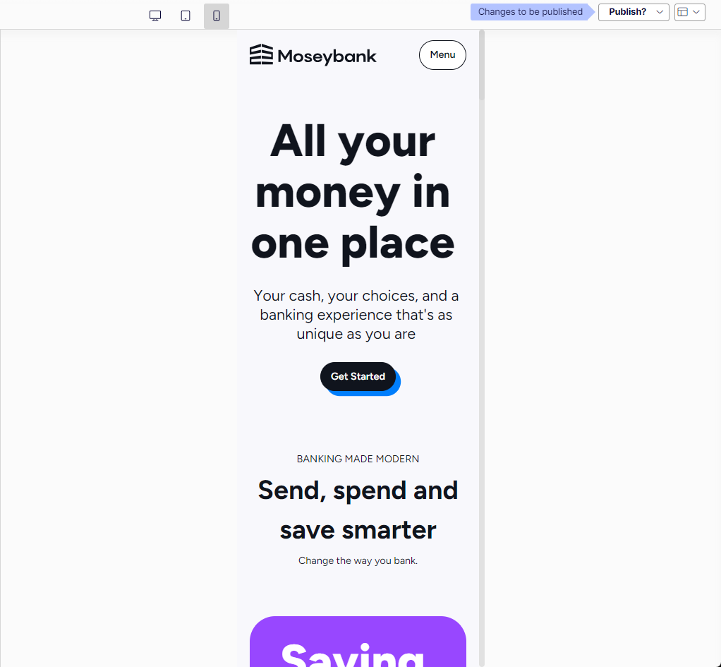
Preview on desktop, tablet, or mobile devices
Click the view icons to display your content in desktop, tablet, or mobile views. Custom view options are not available.

-
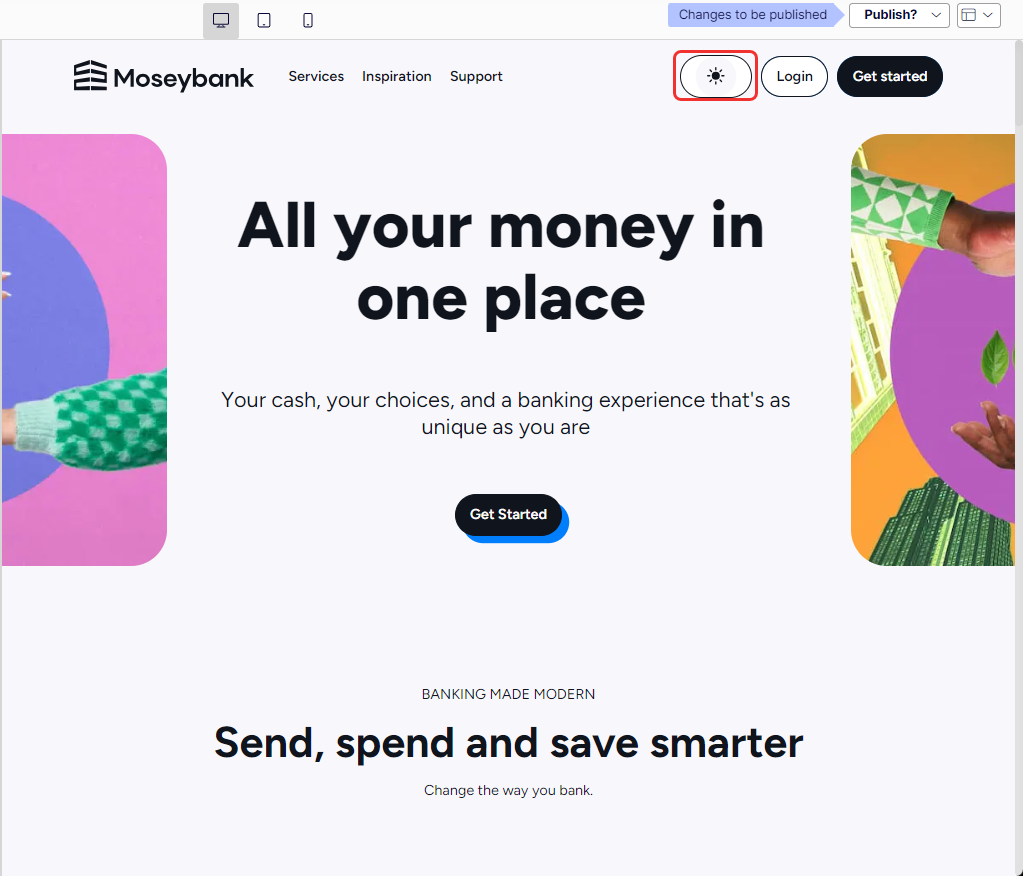
Desktop view
-
Tablet view
-
Mobile view