Get started with Visual Builder
Learn to create and edit content visually for dynamic digital experiences.
Visual Builder is the editor interface in Optimizely Content Management System (CMS 13) that makes content creation and layout building intuitive and accessible. Content creators can design, modify, and reuse layout templates directly in the user interface (UI) to create adaptable experiences for any channel, without developer involvement. Front-end developers can also empower editors to modify the style of the content they create while adhering to brand guidelines. See an interactive demo on how to approach content modeling in CMS 13 and Visual Builder.
See also Configure Visual Builder (for developers) for Visual Builder developer information.
Visual Builder syncs content between the outline and the preview panel, so you see your changes immediately. See also Preview Visual Builder content.
Visual Builder concepts
Visual Builder uses the following core concepts to organize and build content.
Element
Elements are the building blocks for creating content. See Elements in Visual Builder.
Elements can be as simple as a Heading with a single text input field or more complex with various optional and required fields.
You can also define custom elements. See Content types.
Elements do not have a layout. As an editor, you cannot divide elements or modify their structure. You should define only unchanging structures as elements.
Section
Sections are horizontal slices of a page comprised of elements. Sections use rows and columns in a grid layout to structure content. You can save sections as a reusable blueprint.
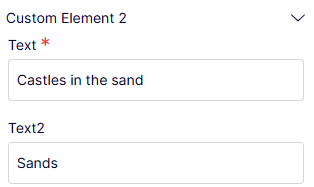
Outline
An outline is a list view of your sections. Drag and drop a section to any order or go to the content you want to edit by hovering over the section in the preview or the outline.
Pages in Visual Builder
Pages in Visual Builder are flexible and composable web or application pages that display in a list. They are comprised of sections that you can save as reusable blueprints. See Create Visual Builder content from scratch and Create Visual Builder content from a blueprint.
Blueprint
Blueprints are reusable layout templates that editors can create directly in the UI. Save sections and experiences as blueprints. See Manage blueprints.
Style
Style settings let you modify the appearance of content based on pre-approved guidelines. Apply style to any level of Visual Builder content, such as elements, rows and columns, sections, or experiences. See Select Visual Builder styles.
Elements in Visual Builder
Elements are the building blocks for creating content in the Visual Builder.
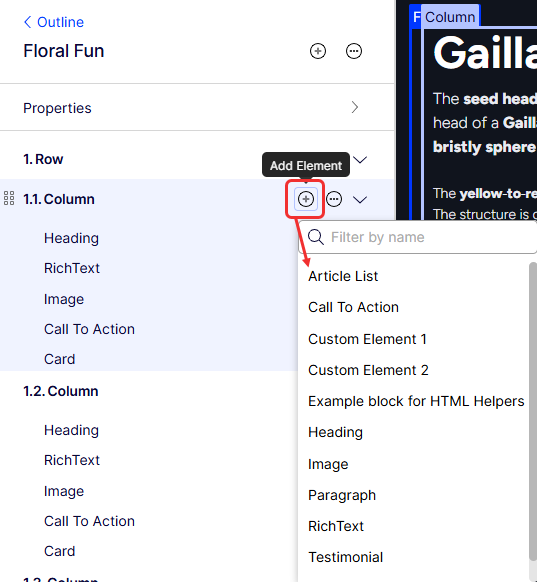
Visual Builder has several built-in elements that you can add to columns by selecting Add Element (+) > element name as shown in the following image.
Administrators can define additional elements. See Create a content type.
An element can be as simple as a Heading with a single text input field, or more complex, like the Testimonial element. They can have optional and required input fields.
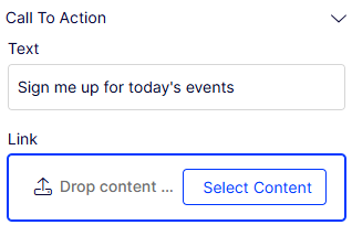
Call To Action element
To create a Call To Action element, click Select Content to use content from the content tree, or drag content from the Assets pane (Shared Blocks and Media).
If the Call to Action element already exists, replace, edit, or remove it by selecting More (...).
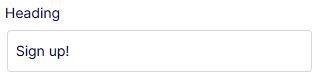
Custom Element 1 and 2
To create custom elements, see Content types.
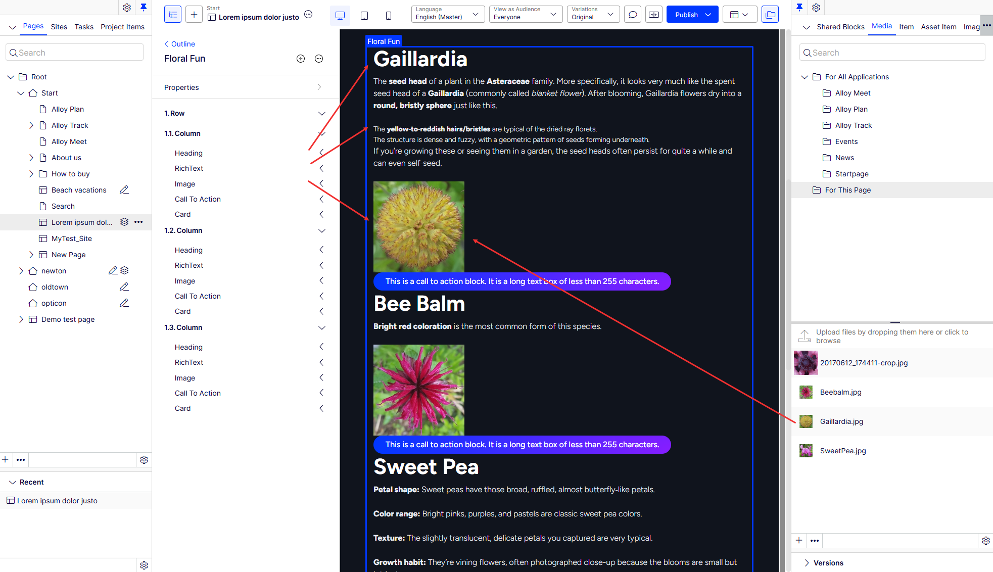
Heading element
Enter text into the Heading element. Select More (...) > Style to display the heading based on styles configured in CMS 13. See Select Visual Builder styles.
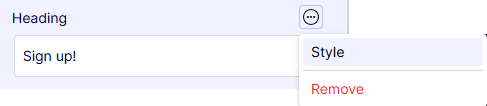
Image element
Drag an image or click Select Image.
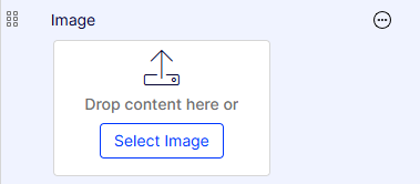
The Select Image window displays. The CMS asset tree displays. Select an image and click OK.
For existing images, replace, edit, and remove them from the More (...) menu.
Select More (...) > Style to display the image based on styles configured in CMS 13. See Select Visual Builder styles.
RichText element
Enter text into the RichText element. See also Edit content using TinyMCE.
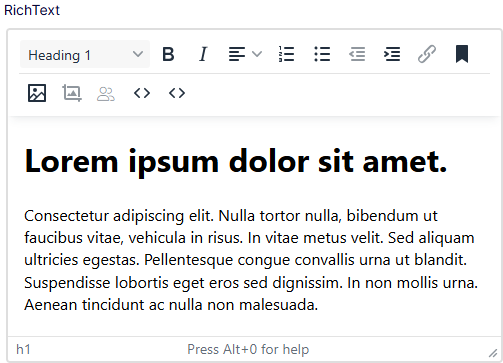
NoteVisual Builder uses the TinyMCE editor for RichText elements. You can customize the TinyMCE editor. Styles are not configured for the RichText element.
Video element
Drag a video file or click Select Video.
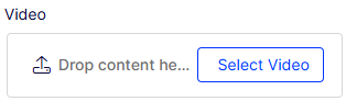
The Select Video window displays. The CMS asset tree displays. Select an image and click OK.
For existing videos, replace, edit, and remove them from the More (...) menu.
Updated about 1 month ago