Choice property
Understand choice properties in Optimizely CMS 13. Learn to define and manage dropdowns, checkboxes, and radio buttons for content editors.
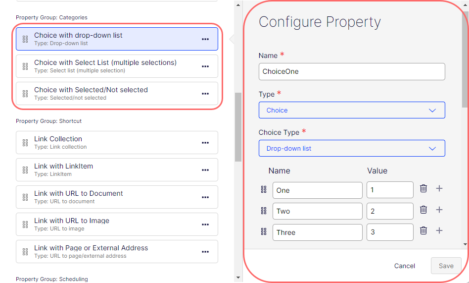
The Choice property type lets content editors select from predefined options such as drop-down lists, multiple selection lists, and single selections. Use it to constrain input to a specific set of values. The following image shows Choice property type examples.
Configure Choice property
The following attributes are available when you configure a Choice property.
-
Name – Enter the name of this Choice property type. This name is used for programming and language settings.
-
Type – Lets you change the content type to any other.
-
Choice Type – Select one of the following:
-
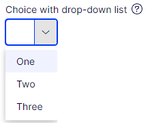
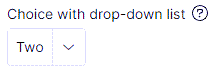
Drop-down list – A user can select only one option from a list that displays when they click on the drop-down list. This type keeps the interface clean and uncluttered because the full list of choices is displayed only when needed. It looks similar to the following when rendered in the All Properties edit view.
-
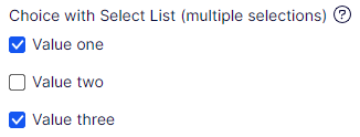
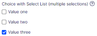
Select List (multiple selection) – Similar to a drop-down list, but lets the user select multiple options. This is useful where more than one applicable choice exists. It looks similar to the following when rendered in the All Properties edit view.
-
Selected/Not selected – A Boolean choice type that is often represented by a checkbox. It lets the user select (activate) or deselect (deactivate) a single option. It looks similar to the following when rendered in the All Properties edit view.

-
-
Value must be entered – Select to require the user to select a choice. Required fields display a red asterisk (*).
-
Unique value per language – See Define language-specific properties.
-
List – Unavailable.
-
Property Indexing Type – Select one of the following to determine how the property is indexed for search. The correct setting depends on the nature of the data in the property and how you intend data to be searched or queried.
- Default – Lets the system decide automatically how to index a property based on its type and context. For instance, string properties are indexed by default to permit full-text search, while date or number values are indexed differently to permit ranged queries.
- Queryable – Indexes in a way to be part of search queries. For example, this indexing type lets you run a search query such as Find all pages where PropertyName equals Value.
- Searchable – Search data inside the property through the search function. For example, use it as part of a free text search where the system looks through searchable fields to find a match. This is useful when you want a content editor or end user to search a body of text, like a product description. It is beneficial to avoid undesired property values in the search index. By default, all properties are searchable.
- Disabled – The property is not indexed for searching purposes. It is not used in search queries, and its content is not searched. This is often used for properties that contain data irrelevant to search results, and disabling indexing enhances system performance.
-
Default value – Select the options to define what value the Number field displays.
-
No default value – The field is empty (no pre-populated content).
-
Inherits value – The field value is derived from another source. This is often used in hierarchical systems where child elements inherit values from their parent elements. For example, a sub-page inherits some property values from its parent page.
-
Custom – Enter the field's default value. For example, you can start the choice by selecting the default value you want, as shown in the following image.
-
-
Display in edit view – Select to display this Choice element on your page. Clear it to hide the Choice element while keeping all the property information.
-
Display name – Enter the text you want to display above the Choice element on the page in All Properties view.
-
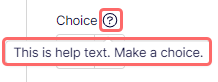
Help text – Enter text to display next to the Display Name. The following image shows how the help text displays.
-
Sort index – Specify a value to determine the order in which data is displayed or processed.
-
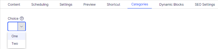
Property Group – Select a property group (Categories, Content, Dynamic Blocks, Preview, Scheduling, SEO Settings, Shortcut) to organize your content on tabs in the All Properties view of the content type. The following image shows a Choice field on the Categories tab (property group) in the All Properties view.