Create a custom widget in Spire
Describes how to create a custom widget in Spire.
In Spire, widgets are pre-configured content holders that allow certain user roles to add content to pages without
having to develop page elements. Widgets can host contextual content, providing users with different views based on persona, language and/or device type.
NoteSome CMS pages with pre-defined content also contain widgets specific to the page content.
In addition to providing pre-defined widgets, Spire lets you override existing widgets or create new, custom widgets. Replacing an existing widget is a good solution if a pre-defined widget covers most of your use cases, but you need to modify it to cover new use cases. On the other hand, a new, custom widget is a good solution if you need to introduce completely new functionality to cover your use cases. The latter is usually more work, but the solution you choose depends on your specific scenario.
Create a custom widget
The steps to create a custom widget in Spire are very similar to overriding an existing widget, with a few exceptions. In this example, create a widget that showcases the ability to add custom CMS field definitions. These field definitions are displayed within the CMS as editable elements.
The Blueprint used for this example is located at /modules/blueprints/example. All of the directory locations
referenced will be relative to the /modules/blueprints/example/src directory.
NoteWe are using the VS Code IDE for this example.
-
Create a directory within the Blueprint. The directory will be located at /Widgets/Common.
-
Add a file named ExampleWidget.tsx within that directory and paste the following code:
/* * This illustrates how to create a widget that makes use of a number of different field definition types. */ import * as React from "react"; import WidgetProps from "@insite/client-framework/Types/WidgetProps"; import { WidgetDefinition } from "@insite/client-framework/Types/ContentItemDefinitions"; import WidgetModule from "@insite/client-framework/Types/WidgetModule"; // this is used to help ensure that the names match between props.fields and definition.fieldDefinitions[].name const enum fields { checkboxFieldValue = "checkboxFieldValue", textFieldValue = "textFieldValue", integerFieldValue = "integerFieldValue", multilineTextFieldValue = "multilineTextFieldValue", radioButtonsFieldValue = "radioButtonsFieldValue", drop-downFieldValue = "drop-downFieldValue", } interface Props extends WidgetProps { fields: { [fields.checkboxFieldValue]: boolean; [fields.textFieldValue]: string; [fields.integerFieldValue]: number; [fields.multilineTextFieldValue]: string; [fields.radioButtonsFieldValue]: string; [fields.drop-downFieldValue]: string; }; } const ExampleWidget: React.FC<Props> = (props) => { return <div> <div>Checkbox value: {props.fields.checkboxFieldValue.toString()} {props.fields.checkboxFieldValue && <span>Is True</span>} {!props.fields.checkboxFieldValue && <span>Is False</span>} </div> <div>Text value: {props.fields.textFieldValue}</div> <div>Integer value: {props.fields.integerFieldValue}</div> <div style={{ whiteSpace: "pre" }}>MultilineText value: {props.fields.multilineTextFieldValue}</div> <div>RadioButtons value: {props.fields.radioButtonsFieldValue}</div> <div>drop-down value: {props.fields.drop-downFieldValue}</div> </div>; }; const definition: WidgetDefinition = { group: "Testing", fieldDefinitions: [ { name: fields.checkboxFieldValue, displayName: "Checkbox", editorTemplate: "CheckboxField", defaultValue: false, fieldType: "General", tooltip: "checkbox tip", }, { name: fields.textFieldValue, displayName: "Text", editorTemplate: "TextField", defaultValue: "", fieldType: "General", tooltip: "text tip", placeholder: "text placeholder", isRequired: true, }, { name: fields.integerFieldValue, displayName: "Integer", editorTemplate: "IntegerField", defaultValue: 0, fieldType: "General", tooltip: "integer tip", placeholder: "integer placeholder", isRequired: true, sortOrder: 0, }, { name: fields.multilineTextFieldValue, displayName: "MultilineText", editorTemplate: "MultilineTextField", defaultValue: "", fieldType: "General", tooltip: "multi line tip", placeholder: "multi line placeholder", isRequired: true, }, { name: fields.radioButtonsFieldValue, displayName: "RadioButtons", editorTemplate: "RadioButtonsField", options: [ { displayName: "Yes", value: "yes", tooltip: "this means yes", }, { displayName: "No", value: "no", tooltip: "this means no", }, ], tooltip: "radio buttons tip", isRequired: true, defaultValue: "", fieldType: "General", }, { name: fields.drop-downFieldValue, displayName: "drop-down", editorTemplate: "drop-downField", options: [ { displayName: "Option1", value: "option1", }, { displayName: "Option2", value: "option2", }, ], tooltip: "drop down tip", isRequired: true, defaultValue: "", fieldType: "General", }, ], }; const widgetModule: WidgetModule = { component: ExampleWidget, definition, }; export default widgetModule; -
Now let's append this code snippet to the end of the file. Every widget in Spire needs to default export a
WidgetModule. It describes to Spire how the widget is rendered and displayed in the CMS, among other things.const widgetModule: WidgetModule = { component: ExampleWidget, definition, }; export default widgetModule; -
Start Spire.
NoteThis step may involve different steps based on how you start Spire. In VS Code, you can use a launch configuration to start Spire using Node.
-
After Spire is up and running, sign into the CMS at
http://localhost:3000/contentadmin. -
After we are signed in, edit the Home page.
-
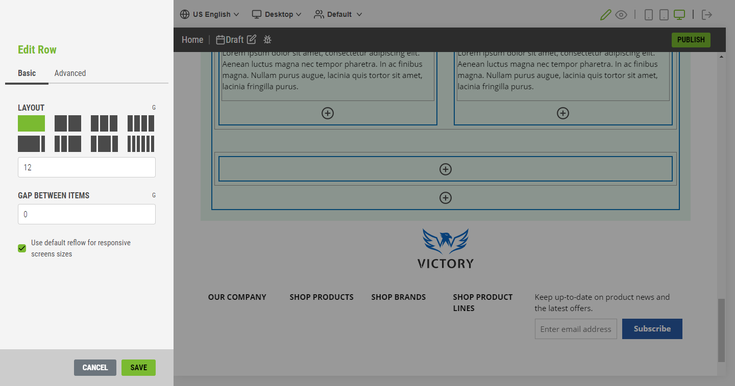
Scroll to the bottom of the page and add a new row.

-
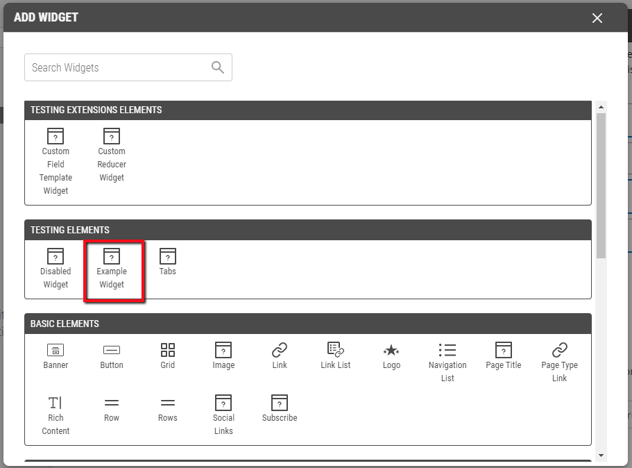
Add the ExampleWidget widget to the new row. We can find it within the Testing Elements group in the Add Widget modal.

-
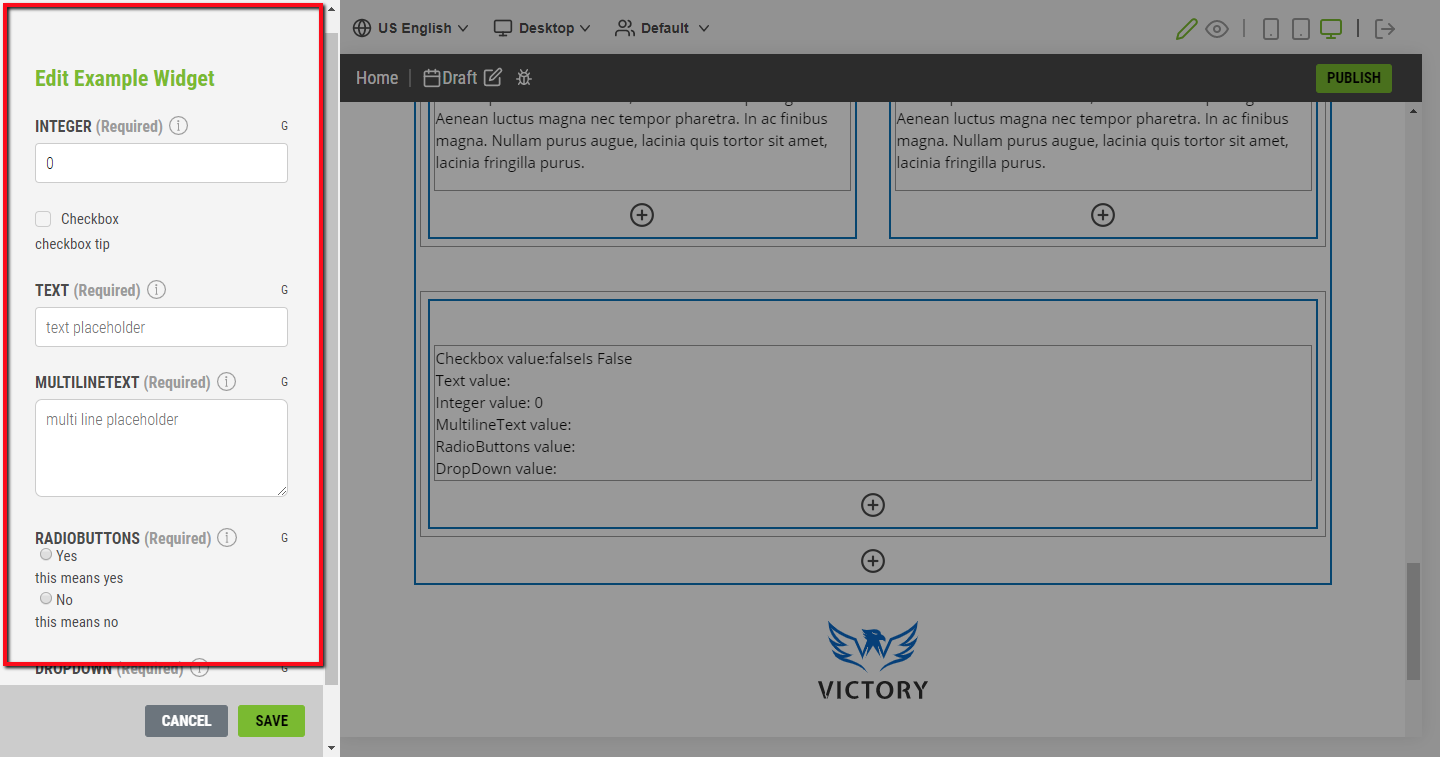
After adding the widget to the page, we can customize the widget using the field definitions defined in code. The CMS displays them in the sidebar.

-
Now, publish the change you just made.
-
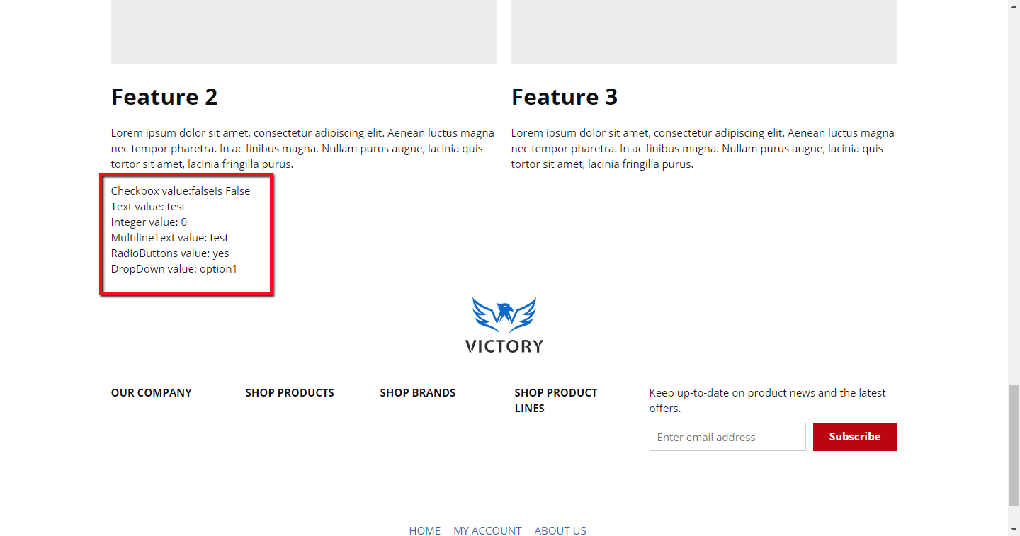
If we log out of the CMS and go to the Home page, we can see our new widget on the page.

Widget field definitions
In Classic, widgets can use pre-defined and custom attributes to instruct the CMS how a widget property can be modified. This construct still applied in Spire, but surfaces as field definitions, as noted in the section Create a Custom Widget above.
Widgets can use pre-defined field definitions, like TextFieldDefinition and ColorPickerFieldDefinition. Additionally, you can create custom field definitions that use React components to create a custom display within the CMS.
Publish custom widgets
Once a custom widget is created, it can be added and published to a page using the CMS following the same workflow as adding and publishing pre-defined widgets. Once added to a page, CMS users can modify it as
allowed using the field definitions defined for the custom widget. Additionally, developers can modify the custom widget in code, where even more granular control over the widget is available.
Updated 2 months ago
