Understand blueprint components
Explains blueprint components.
Use a Spire Blueprint to customize and extend the front end of your Optimizely Configured Commerce website. It is separate from the back end and built on the core code for easier front-end upgrades and extensions.
Blueprints are built on top of and extend Spire. Configured Commerce updates core Spire code automatically when deploying new versions of Configured Commerce. (In Classic, a theme was self-contained and then lived on its own.) The Blueprint is built into a node application that supports server-side rendering.
NoteOptimizely does not support changing a site's Blueprint at run time. You must enter a Support ticket to request to change a site's Blueprint.
Blueprint sandwich
The Spire Blueprint comprises several elements similar to a sandwich. The main element is the Mobius Theme, which describes how each individual component on your site is styled. The Mobius Theme is built on the following components:
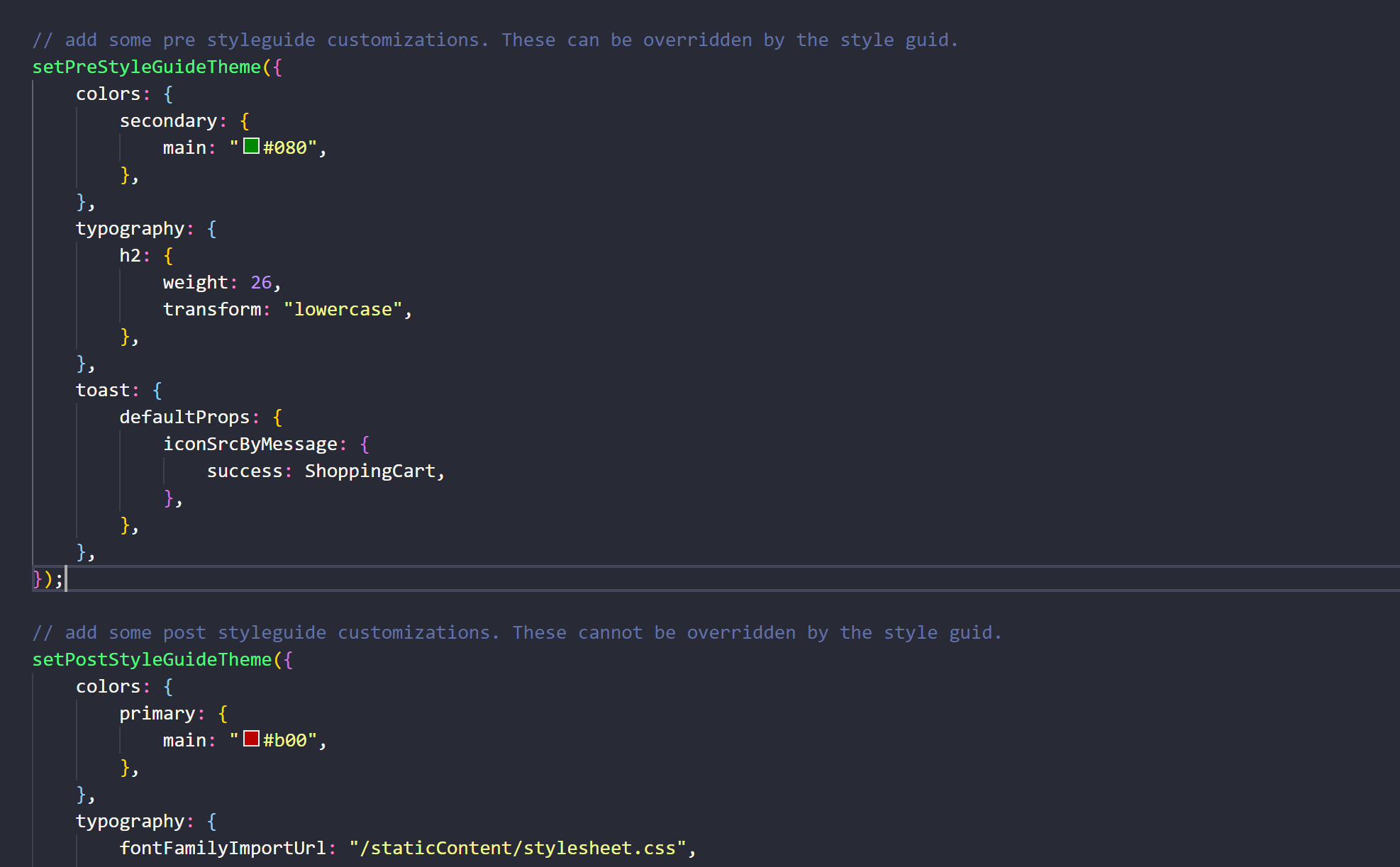
- Post-Style Guide theme (bread) – The post-Style Guide theme is where partners should place only important overrides to the Mobius Theme. Customizations at this layer instruct how your site displays and cannot be overridden by changes in the CMS Style Guide. You can include any value available in the base Mobius Theme to the post and pre-Style Guide themes, such as custom CSS for components. You can also use these themes to change the way your UI front end displays. Developers interact with pre and post-Style Guide themes at
start.tsxwithin theblueprints/[blueprint-name]/src/folder.
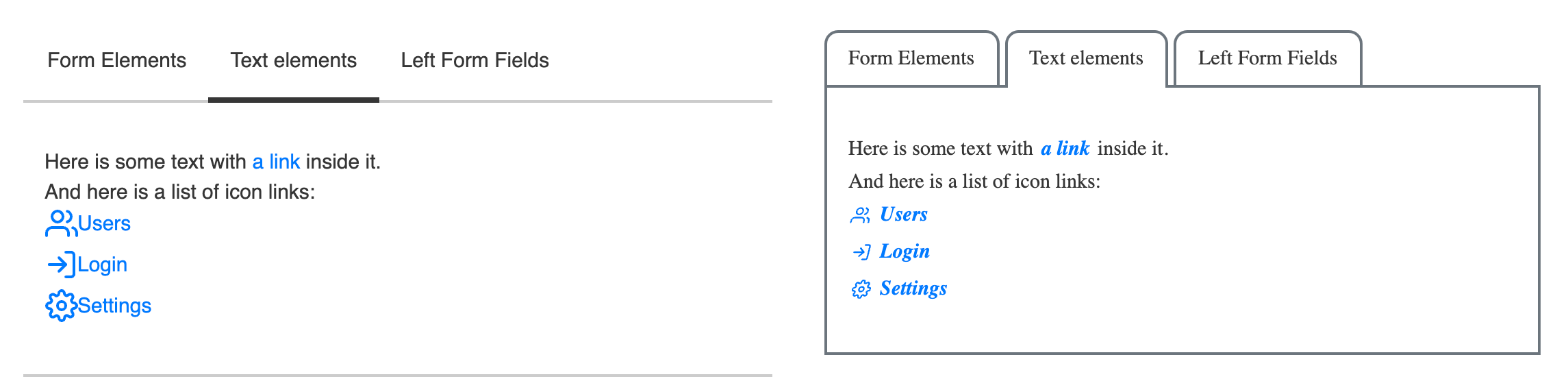
For instance, your partner may use the pre- or post-Style Guide theme to change the look and feel of any tabs on the site as shown below:
-
CMS Style Guide (meat) – This includes all values that can be customized in the CMS Style Guide. This is a limited subset of component attributes and does not include applying custom styling (CSS) or behavior (Javascript) to the components. You can change many things about your site's look and feel using only the style guide, including site colors, the size, shape, and color of buttons and form fields, and icons, among other things. Changes unavailable in the CMS Style Guide UI must be customized by a developer using the pre or post-Style Guide theme or in the Blueprint using widget extension points.
-
Pre-Styleguide Theme (bread) – The pre-Style Guide theme is where partners should place most of their customizations to the Mobius Theme. Although the pre and post-Style Guide themes are technically identical, changes applied in the pre-Style Guide Theme can be overridden by changes in the CMS Style Guide.
-
Base Mobius Theme (plate) – The base Mobius Theme contains all styles that Mobius components receive out of the box. Before you customize your theme, the styles you see are provided by the Mobius Theme. This includes flat square buttons, a sans-serif font, and a blue and gray-based color theme. Anything not explicitly provided by another layer of the theme defaults to the value provided by the base Mobius Theme.
Example of style precedence
The bolded cells in the following table show which value would take precedence on a site.
| Primary color | Form Field Shape | Header 1 Font Weight | Check box Icon | |
|---|---|---|---|---|
| Post Styleguide Theme | normal | |||
| CMS Style Guide | aqua | 800 | ||
| Pre-Styleguide Theme | purple | rounded | ||
| Base Mobius Theme | blue | rectangle | 700 | check |
Code examples
Examples of interactions with pre-Style Guide and post-Style Guide CSS are below. Add this code to the {blueprint}/src/Start.tsx file.
Updated 9 months ago