Dialog boxes
Describes how to use dialog boxes in CMS 12.
The Optimizely Content Management System (CMS) user interface uses dialog boxes in many places to communicate information or perform tasks within the current view.
The following examples are on the Optimizely's GitHub. You can clone the CMS repository: see doc/how-to-use-dialogs branch and run the site to see working examples.
Alert dialog box
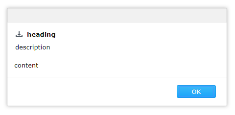
The Alert dialog box displays information that a user acknowledges but is not required to perform any action.
require(["epi/shell/DialogService"], function (dialogService) {
  dialogService.alert({
    heading: "heading",
    content: "content",
    description: "description",
    iconClass: "epi-iconDownload"
  });
});
Confirmation dialog box
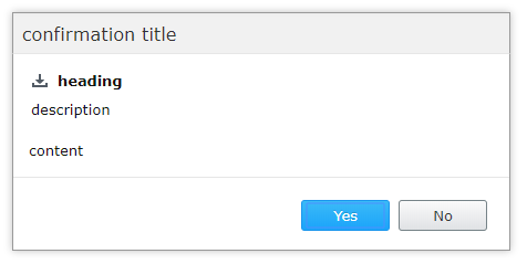
The Confirmation dialog displays information for which a user must decide. It returns a promise that is resolved after clicking OK or rejected after clicking Cancel.
require(["epi/shell/DialogService"], function (dialogService) {
  dialogService.confirmation({
    title: "confirmation title",
    heading: "heading",
    content: "content",
    description: "description",
    iconClass: "epi-iconDownload"
  }).then(function () {
    alert("clicked OK");
  }).otherwise(function () {
    alert("clicked cancel");
  });
});
Standard dialog box
The standard Dialog displays custom content. You should create a widget that displays and manages the component's business logic and use the standard dialog as a display container.
You can create a Dialog widget instance manually:
require([
  "epi/shell/widget/dialog/Dialog",
  "dijit/form/TextBox"
], function (Confirmation, TextBox) {
  var dialog = new Dialog({
    heading: "heading",
    content: new TextBox({
      label: "Text 1",
      _type: "field"
    }),
    description: "description",
    iconClass: "epi-iconDownload"
  });
  dialog.on("execute", function () {
    // run custom needed logic
    dialog.hide();
  });
  dialog.show();
});
Or use another dialogService method:
require([
  "epi/shell/widget/dialog/Dialog",
  "dijit/form/TextBox"
], function (Confirmation, TextBox) {
  dialogService.dialog({
      title: "dialog title",
    heading: "heading",
    content: new TextBox({
      label: "Text 1",
      _type: "field"
    }),
    description: "description",
    iconClass: "epi-iconDownload"
  }).then(function () {
    alert("clicked OK");
  }).otherwise(function () {
    alert("clicked cancel");
  });
});
Callbacks
CMS dialog boxes are based on Dojo Dialog. You can read the Dojo dialog box documentation for further information about events or other properties that can be passed as dialog parameters.
Action labels
Each dialog box has properties that define the labels to be displayed. You can customize the default labels for actions when you construct the dialog box using acknowledgeActionText for the alert dialog box and confirmActionText and cancelActionText for the confirmation and standard dialogs. There are common action labels localized in epi.resources.action.
Change available actions (Legacy)
NoteWhile existing solutions will continue to work, you should not build new solutions on this API. It will be phased out in the future.
When you use the standard dialog, there are times when the displayed widget needs to add actions to the action pane; a provider and consumer pattern is implemented to facilitate this in a decoupled fashion. The standard dialog is an epi.shell.widget._ActionConsumer and your widget inside the dialog implements the epi.shell.widget._ActionProviderWidget and supply its actions using the addActions method.
require(
  ["dojo/_base/declare",
    "dijit/layout/_LayoutWidget",
    "epi/shell/widget/dialog/Dialog",
    "epi/shell/widget/_ActionProviderWidget"
  ],

  function (declare, _LayoutWidget, Dialog, _ActionProviderWidget) {
    var MyActionProviderWidget = declare([_LayoutWidget, _ActionProviderWidget], {
      startup: function () {
        this.inherited(arguments);
        this.addActions({
          name: "hello",
          label: "Say hello",
          iconClass: "buttonClass",
          action: hitch(this, function () {
            this._sayHello();
          })
        });
      },
      _sayHello: function () {
        console.log("Hello!");
      }
    });
    var providerWidget = new MyActionProviderWidget();
    var dialog = new Dialog({
      content: providerWidget
    });
    dialog.show();
  }
);
You can manually register a provider with a consumer by supplying it to the constructor arguments of the consumer.
require(
  ["dojo/_base/declare",
    "dojo/_base/lang",
    "epi/shell/widget/dialog/Dialog",
    "epi/shell/widget/_ActionProvider"
  ],
  function (Dialog, _ActionProvider) {
    var MyActionProvider = declare(
      [_ActionProvider], {
        getActions: function () {
          return [{
            name: "hello",
            label: "Say hello",
            iconClass: "buttonClass",
            action: lang.hitch(this, function () {
              this._sayHello();
            })
          }];
        },
        _sayHello: function () {
          console.log("Hello!");
        }
      });
    var provider = new MyActionProvider();
    var dialog = new Dialog({
      content: "Some dialog content.",
      actionProviders: [provider]
    });

    // Act
    dialog.show();
  }
);
If you do not have any use for the default dialog buttons, you can remove them by setting defaultActionsVisible to false when constructing the dialog box.
Change the state of actions
To change the state of an action during the lifetime of a dialog box, such as turning an action on or off, call _ActionProvider.setActionProperty().
<script type = "text/javascript">
	require(
		["dojo/_base/declare",
			"dojo/_base/lang",
			"dijit/_Widget",
			"epi/shell/widget/dialog/Dialog",
			"epi/shell/widget/_ActionProviderWidget"
		],
		function(declare, lang, _Widget, Dialog, _ActionProviderWidget) {
			// Implement a widget inheriting the action provider widget
			var MyActionProvider = declare([_Widget, _ActionProviderWidget], {
				startup: function() {
					this.inherited(arguments);
					// Add an action to the dialog toolbar
					this.addActions({
						name: "disableme",
						label: "Click to disable",
						action: lang.hitch(this, function() {
							// When the action is executed we disable this action
							this.setActionProperty("disableme", "disabled", true);
						})
					});
				}
			});
			var dialog = new Dialog({
				content: new MyActionProvider()
			});
			dialog.show();
		});
</script>
Updated 8 months ago
