Flag variable example with an image carousel
An example iOS application that walks through creating and implementing flag variables in Optimizely Feature Experimentation to create an image carousel that updates based on what variation the user receives.
This example demonstrates how to create an iOS application featuring an image carousel (also called an image slider) to promote new products.
Each slide in the carousel includes the following:
- A product image.
- A marketing tagline.
- A button with configurable text, color, and size that, when tapped, launches a web page or application.
- An optional click action on the product image that goes to a different URL or page.
For this example, use Feature Experimentation to define the image carousel's flag variables, create three possible variations, and configure an A/B test rule. In the iOS application, the Swift SDK decides which variation a user sees, and the flag variable values dynamically configure and build the image carousel.
Create flag variables in Feature Experimentation
Using the Feature Experimentation UI or the Create a New Flag API endpoint, create a flag named image_carousel_flag.
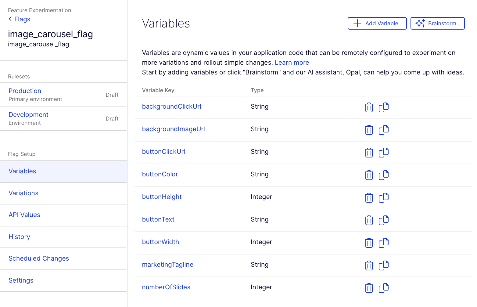
Next, define the following flag variables with the specified keys using the UI or the Create Variable Definition API endpoint:
numberOfSlides– Integer – Defines how many slides the image carousel has.buttonText– String – The text caption shown on the button (for example, "Submit" or "Learn More").buttonColor– String – The color value for the button, which could be a hex string (for example,#FF0000) or any format your application supports.backgroundImageUrl– String – The URL of the background image for each slide.buttonClickUrl– String – The URL or path to launch when the button is clicked.backgroundClickUrl– String – The URL or path to launch when the background image is clicked.marketingTagline– String – The text message overlaid on the image carousel slide.buttonWidth– Integer – The width (in points) of the button.buttonHeight– Integer – The height (in points) of the button.
Your flag's Variable page should display similarly to the following:
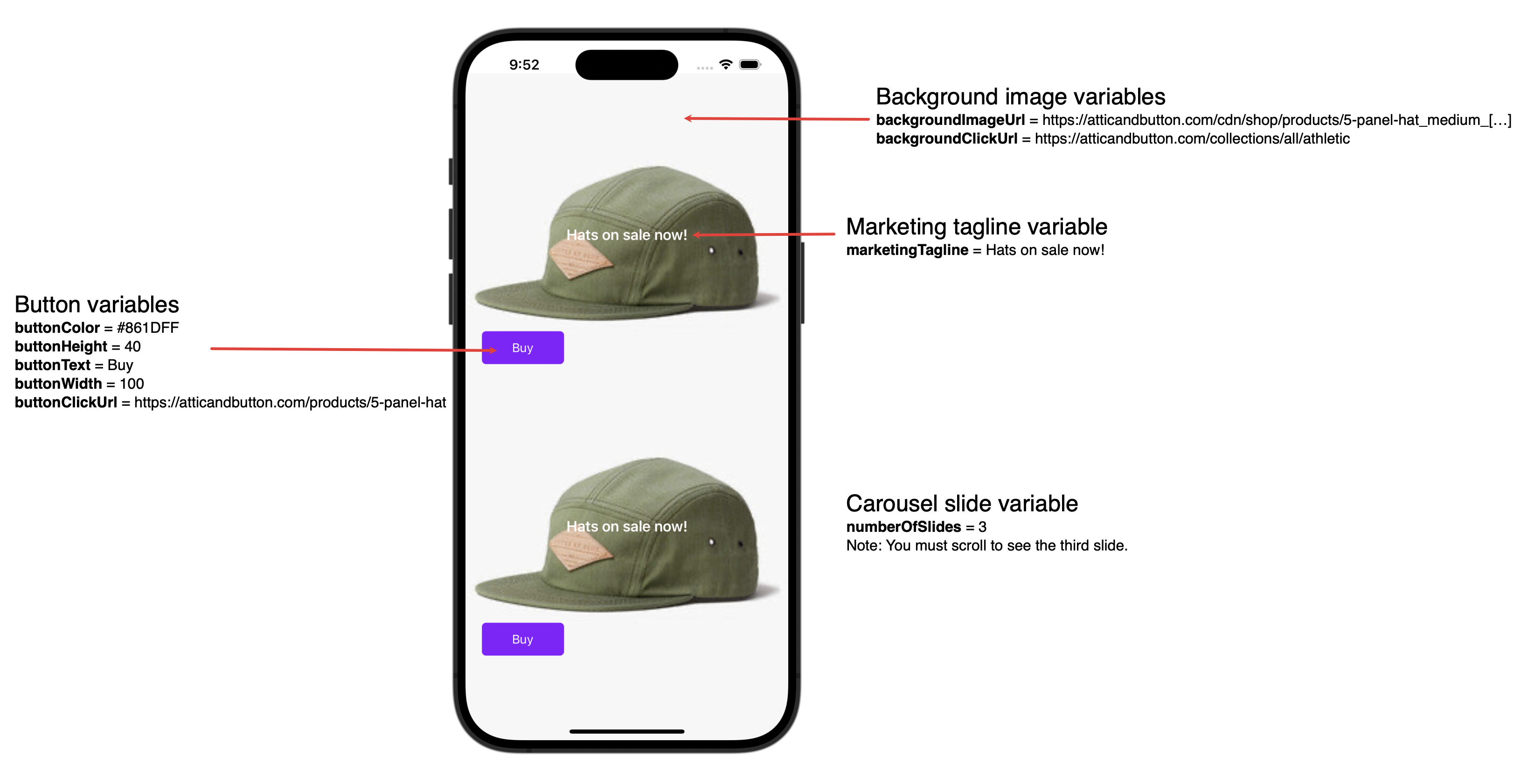
These variables correspond to the following in the application:
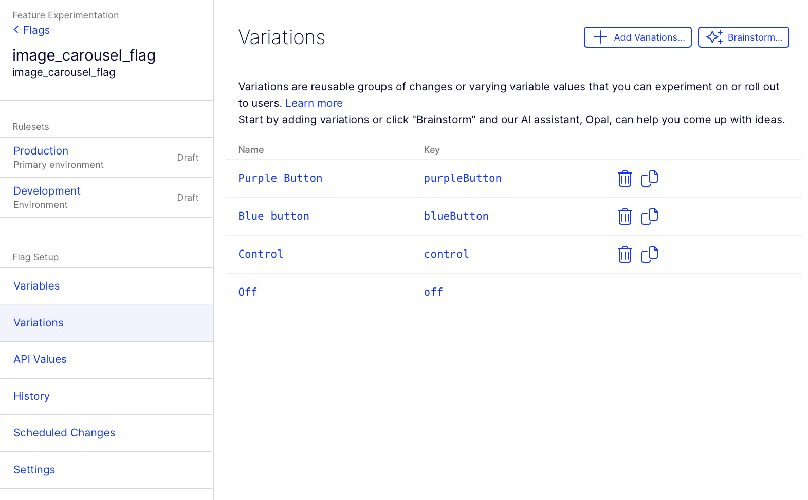
Create variations in Feature Experimentation
First, use the Feature Experimentation UI or the Delete a Variation API endpoint to delete the default On variation. Then, using the Feature Experimentation UI or Create a New Variation API endpoint, configure the following variations:
NoteThe only difference between the variations in this example is the
buttonColor. You can create the control variation and then click Duplicate variation and update the Name, Key andbuttonColorvariable accordingly to create the three variations.
Control
- Name – Control
- Key –
control - Variables
backgroundClickUrl–https://atticandbutton.com/collections/all/athleticbackgroundImageUrl–https://atticandbutton.com/cdn/shop/products/5-panel-hat_medium_630ad61c-e050-4046-bdbb-efa5151351af_1024x1024.jpeg?v=1437449607buttonClickUrl–https://atticandbutton.com/products/5-panel-hatbuttonColor–#FFFFFFbuttonHeight– 40buttonText– BuybuttonWidth– 100marketingTagline– Hats on sale now!numberOfSlides– 3ImportantThe
numberOfSlidesvariable must be the same for all variations, otherwise the application may not render correctly.
Variation 1 - #00CCFF
- Name – Blue button
- Key –
blueButton - Variables
backgroundClickUrl–https://atticandbutton.com/collections/all/athleticbackgroundImageUrl–https://atticandbutton.com/cdn/shop/products/5-panel-hat_medium_630ad61c-e050-4046-bdbb-efa5151351af_1024x1024.jpeg?v=1437449607buttonClickUrl–https://atticandbutton.com/products/5-panel-hatbuttonColor–#00CCFFbuttonHeight– 40buttonText– BuybuttonWidth– 100marketingTagline– Hats on sale now!numberOfSlides– 3
Variation 2 – #861DFF
- Name – Purple button
- Key –
purpleButton - Variables
backgroundClickUrl–https://atticandbutton.com/collections/all/athleticbackgroundImageUrl–https://atticandbutton.com/cdn/shop/products/5-panel-hat_medium_630ad61c-e050-4046-bdbb-efa5151351af_1024x1024.jpeg?v=1437449607buttonClickUrl–https://atticandbutton.com/products/5-panel-hatbuttonColor–#861DFFbuttonHeight– 40buttonText– BuybuttonWidth– 100marketingTagline– Hats on sale now!numberOfSlides– 3
Your Variations page should display similarly.
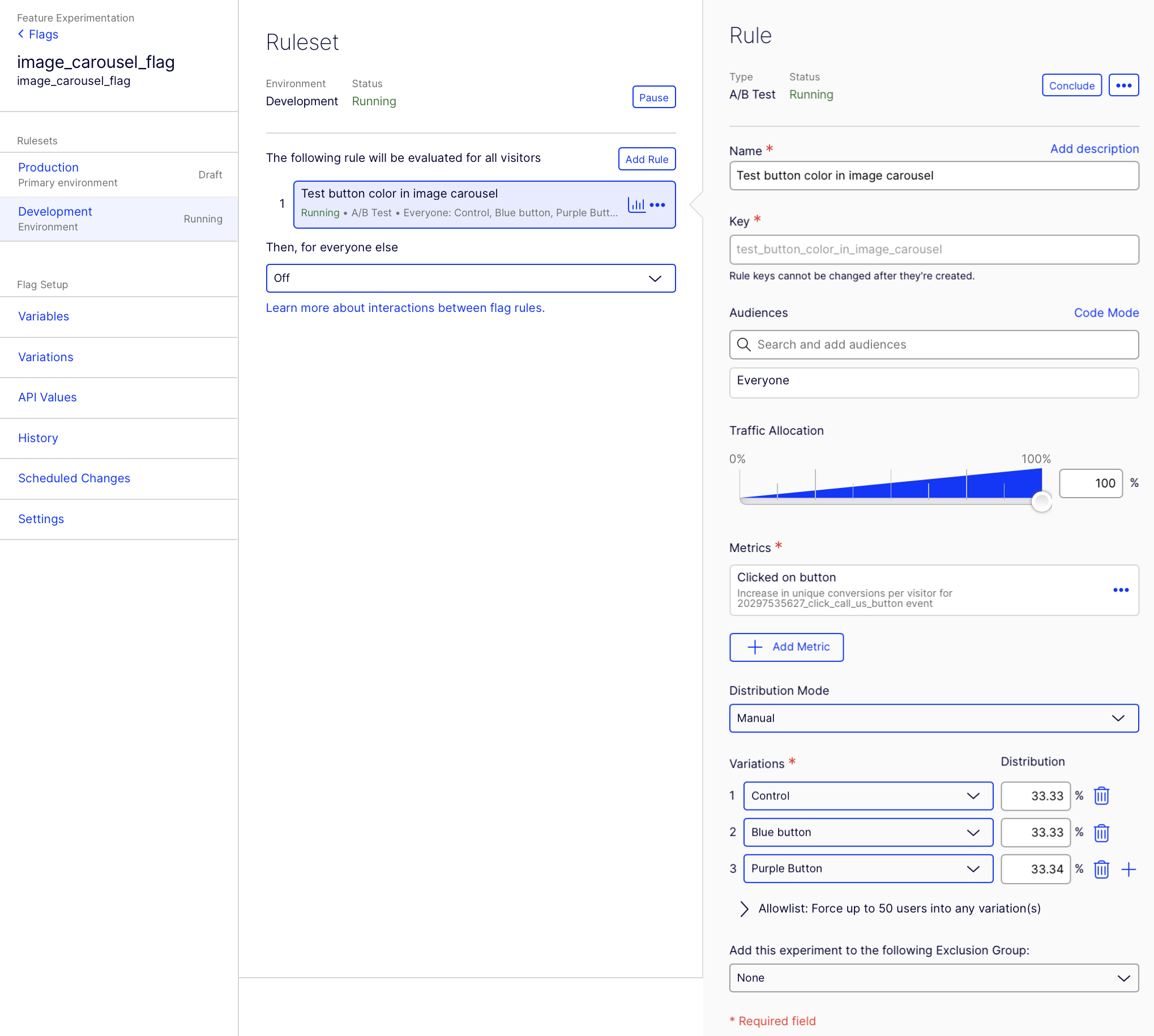
Create an A/B test rule in Feature Experimentation
Create an A/B Test rule in your Development environment using the Feature Experimentation UI. Configure your primary metric as the increase in unique conversions of a click event on the button. Add the three variations created in the Create variations in Feature Experimentation section and distribute traffic evenly between them.
After creating your rule, click Run on your rule and image_carousel_flag flag.
Run example code
The following Swift example code creates an image carousel that can update its appearance based on the variables in Feature Experimentation and updates the button's background color based on what variation the user is bucketed into.
Before running the Swift example code, install the Feature Experimentation Swift SDK in your Xcode project. Next, copy and paste the example code into your ViewController. Then, replace <YOUR_SDK_KEY> in the OptimizelyClient initialization by copying and pasting your SDK key from the Optimizely UI for your Development environment.
import UIKit
// Import the Optimizely iOS SDK for Feature Experimentation
import Optimizely
class ViewController: UIViewController {
// MARK: - Properties
// Replace this with the real OptimizelyClient initialization
let optimizelyClient = OptimizelyClient(sdkKey: "<YOUR_SDK_KEY>")
// Example: A simple model for each slide in the carousel
struct CarouselSlide {
let backgroundImageUrl: String
let marketingTagline: String
let buttonText: String
let buttonColor: String
let buttonClickUrl: String
let backgroundClickUrl: String
let buttonWidth: Int
let buttonHeight: Int
}
var slides: [CarouselSlide] = []
// MARK: - View Lifecycle
override func viewDidLoad() {
super.viewDidLoad()
// Start the Optimizely client to fetch the datafile
optimizelyClient.start { [weak self] result in
switch result {
case .failure(let error):
print("Error starting Optimizely Client: \(error)")
// Fallback logic could go here
case .success:
// Successfully started the client, now decide which variation this user sees
self?.configureCarousel()
}
}
}
// MARK: - Carousel Configuration
func configureCarousel() {
// The flag key as defined in your Optimizely project
let flagKey = "image_carousel_flag"
// This is a unique user ID. In production, use something that identifies the user
let user = optimizelyClient.createUserContext(userId: "user123")
// Decide which variation the user sees.
// Note: The actual method or function name may vary depending on the Swift SDK version
let decision = user.decide(key: flagKey)
// Check if the flag is enabled; if not, use fallback or default logic
guard decision.enabled == true else {
print("Flag '\(flagKey)' is not enabled. Using default configuration.")
return
}
// all variable values
let allVarValues: OptimizelyJSON = decision.variables
print(allVarValues)
// Retrieve the variable values from the decision object.
// Depending on the SDK version, you might access them differently:
// 1. Integer variable for numberOfSlides
let numberOfSlides: Int? = decision.variables.getValue(jsonPath: "numberOfSlides")
// Initialize an array to store slides
var tempSlides: [CarouselSlide] = []
// Loop over numberOfSlides to build our slides
for _ in 0..<numberOfSlides! {
// 2. String variable for the text caption for the button
let buttonText: String? = decision.variables.getValue(jsonPath: "buttonText") ?? "Default Button"
// 3. String variable for the color value for the button
let buttonColor: String? = decision.variables.getValue(jsonPath: "buttonColor") ?? "#000000"
// Default color black
// 4. String variable for the path or url of the background image
let backgroundImageUrl: String? = decision.variables.getValue(jsonPath: "backgroundImageUrl") ?? ""
// 5. String variable for path or url to launch when the button is clicked
let buttonClickUrl: String? = decision.variables.getValue(jsonPath: "buttonClickUrl") ?? ""
// 6. String variable for path or url to launch when the background image is clicked
let backgroundClickUrl: String? = decision.variables.getValue(jsonPath: "backgroundClickUrl") ?? ""
// 7. String variable for the marketing message overlaid on the carousel
let marketingTagline: String? = decision.variables.getValue(jsonPath: "marketingTagline") ?? "Welcome!"
// 8. Integer variable for button width
let buttonWidth: Int? = decision.variables.getValue(jsonPath: "buttonWidth") ?? 100
// 9. Integer variable for button height
let buttonHeight: Int? = decision.variables.getValue(jsonPath: "buttonHeight") ?? 40
// Create our slide model
let slide = CarouselSlide(backgroundImageUrl: backgroundImageUrl!,
marketingTagline: marketingTagline!,
buttonText: buttonText!,
buttonColor: buttonColor!,
buttonClickUrl: buttonClickUrl!,
backgroundClickUrl: backgroundClickUrl!,
buttonWidth: buttonWidth!,
buttonHeight: buttonHeight!)
tempSlides.append(slide)
}
// Assign the slides array to our class property
self.slides = tempSlides
// Build the UI for the carousel
DispatchQueue.main.async {
self.setupCarouselUI()
}
}
// MARK: - Setup Carousel UI
func setupCarouselUI() {
// This function is responsible for laying out the UI elements of the carousel.
// For simplicity, let's assume we just build a vertical stack of "slides" (though
// a real carousel might use a UIScrollView, UICollectionView, or a custom component).
let scrollView = UIScrollView(frame: self.view.bounds)
scrollView.autoresizingMask = [.flexibleWidth, .flexibleHeight]
self.view.addSubview(scrollView)
var yOffset: CGFloat = 0
for (index, slide) in slides.enumerated() {
// Container for the slide
let slideView = UIView(frame: CGRect(x: 0, y: yOffset, width: self.view.frame.width, height: 300))
slideView.backgroundColor = .white
// Background image (in a real app, you would load asynchronously)
if let bgUrl = URL(string: slide.backgroundImageUrl),
let data = try? Data(contentsOf: bgUrl),
let image = UIImage(data: data) {
let backgroundImageView = UIImageView(image: image)
backgroundImageView.contentMode = .scaleAspectFill
backgroundImageView.frame = slideView.bounds
backgroundImageView.isUserInteractionEnabled = true
// Background click gesture
let bgTap = UITapGestureRecognizer(target: self, action: #selector(backgroundTapped(_:)))
backgroundImageView.addGestureRecognizer(bgTap)
backgroundImageView.tag = index // store the slide index
slideView.addSubview(backgroundImageView)
// Overlaid marketing message
let messageLabel = UILabel(frame: CGRect(x: 20,
y: slideView.bounds.height/2 - 20,
width: slideView.bounds.width - 40,
height: 40))
messageLabel.text = slide.marketingTagline
messageLabel.textColor = .white
messageLabel.textAlignment = .center
messageLabel.font = UIFont.boldSystemFont(ofSize: 18)
backgroundImageView.addSubview(messageLabel)
}
// Button
let button = UIButton(type: .system)
button.setTitle(slide.buttonText, for: .normal)
// Convert color string to UIColor if your app supports hex parsing
// For simplicity, assume a function hexStringToUIColor exists
button.backgroundColor = hexStringToUIColor(hex: slide.buttonColor)
// Use the buttonWidth and buttonHeight from the flag variables
button.frame = CGRect(x: 20,
y: slideView.bounds.height - CGFloat(slide.buttonHeight) - 20,
width: CGFloat(slide.buttonWidth),
height: CGFloat(slide.buttonHeight))
button.setTitleColor(.white, for: .normal)
button.layer.cornerRadius = 5
// Button click action
button.tag = index // store the slide index
button.addTarget(self, action: #selector(buttonTapped(_:)), for: .touchUpInside)
slideView.addSubview(button)
scrollView.addSubview(slideView)
yOffset += slideView.frame.height
}
scrollView.contentSize = CGSize(width: self.view.frame.width, height: yOffset)
}
// MARK: - Actions
@objc func buttonTapped(_ sender: UIButton) {
let slide = slides[sender.tag]
// Launch the buttonClickUrl when the button is tapped
if let url = URL(string: slide.buttonClickUrl) {
// In a real app, consider SFSafariViewController or an in-app browser
UIApplication.shared.open(url, options: [:], completionHandler: nil)
}
}
@objc func backgroundTapped(_ sender: UITapGestureRecognizer) {
guard let bgView = sender.view else { return }
let slide = slides[bgView.tag]
// Launch the backgroundClickUrl
if let url = URL(string: slide.backgroundClickUrl) {
UIApplication.shared.open(url, options: [:], completionHandler: nil)
}
}
// MARK: - Helper
func hexStringToUIColor(hex: String) -> UIColor {
// Very basic hex to UIColor converter
var cString = hex.trimmingCharacters(in: .whitespacesAndNewlines).uppercased()
// Remove '#' if present
if cString.hasPrefix("#") {
cString.removeFirst()
}
// If not 6 or 8 characters, return gray
if cString.count != 6 && cString.count != 8 {
return UIColor.gray
}
// If 8 characters, assume ARGB
if cString.count == 8 {
let aString = String(cString.prefix(2))
cString.removeFirst(2)
var a: UInt64 = 0
Scanner(string: aString).scanHexInt64(&a)
// For brevity, ignoring alpha logic
return UIColor.gray
}
var rgbValue: UInt64 = 0
Scanner(string: cString).scanHexInt64(&rgbValue)
return UIColor(
red: CGFloat((rgbValue & 0xFF0000) >> 16) / 255.0,
green: CGFloat((rgbValue & 0x00FF00) >> 8) / 255.0,
blue: CGFloat(rgbValue & 0x0000FF) / 255.0,
alpha: 1.0
)
}
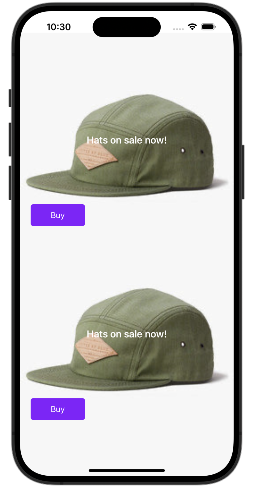
}Run the code. In this instance, the user was bucketed into the purpleButton variation and their button displays in purple.
Conclusion
While this example focuses on an image carousel, you can apply the same approach to any UI component to control its content, style, and behavior directly from Feature Experimentation.
For example:
- Promotional banner – Configure headline text, subtext, background color, and button link.
- Popup modal – Control title text, description text, button style (color and size), and trigger conditions.
- Dynamic form – Adjust form fields, validation messages, and submission endpoint URL.
- Navigation bar – Set menu item labels, icon visibility, background color, and click behavior for each item.
- Product recommendations widget – Select which products to display, customized call-to-action text, and style fonts or layout.
By using flag variables, you can standardize and manage these UI changes without modifying or redeploying the underlying application code.
Updated 3 months ago