Form elements
Form elements in CMS (SaaS) Visual Builder
Form elements are essential components in Optimizely CMS (SaaS) that let you create interactive forms for capturing data from website visitors. These elements include text fields, checkboxes, radio buttons, dropdown lists, and more, each serving a specific purpose in data collection.
Developers can customize the forms to meet specific business needs. By leveraging these elements, content creators can enhance user engagement, gather valuable insights, and improve the overall user experience on their websites.
The following form elements are built into CMS (SaaS).
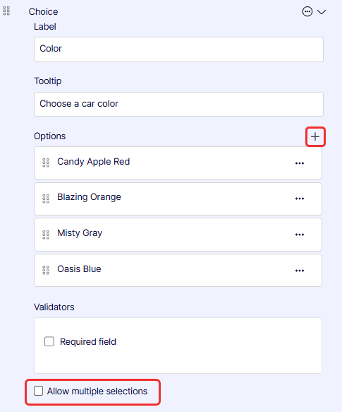
Choice
Choice displays a list of single-choice radio buttons or multiple-choice checkboxes. See also Selection, which creates a drop-down list with single or multiple selections.
-
Label – Enter the text of the label that displays on the form.
-
Tooltip – Enter text to display when the visitor hovers over the field for information.
-
Options – Click Add (+) to specify more options.
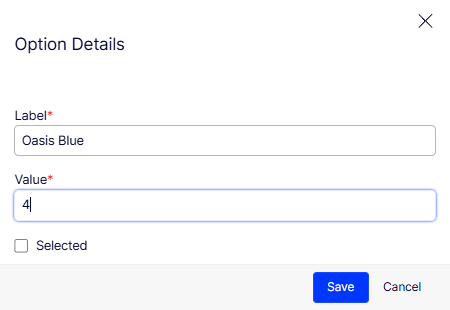
- Label – Enter the text to label the option.
- Value – Enter the value, which is not displayed, but you can use the value (such as 4 or chocolate; something meaningful to you) in your reports.
- Selected – Enable to make this the option selected by default. The user would have to unselect it.
-
Validators – Select Required field if you want to ensure the form data cannot be submitted unless you have it filled in. A red asterisk (*) displays next to required fields.
-
Allow multiple selections – Select to let the user select one or more of the options.
Number
Number restricts visitor input to a number in the field, such as for a Quantity of items to purchase.
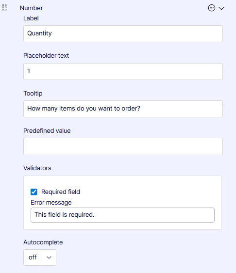
- Label – Enter the text of the label that displays on the form.
- Placeholder text – Give an example of what you want in the field. It is not recorded in the form data.
- Tooltip – Enter text to display when the visitor hovers over the field for information.
- Predefined value – Internally name or code submitted form data to distinguish the data from other data. For example, you might enter Christmas in one form and Hanukkah in another to know that the form submissions are related to a particular marketing campaign.
- Validators – Select Required field if you want to ensure the form data cannot be submitted unless you have it filled in. A red asterisk (*) displays next to required fields.
- Error message – Enter a text message to display if the field data does not comply with its restrictions.
- Email – Select to require a valid email address.
- Number – Select to allow only integers in the field.
- Regular expression – Select to allow a regular expression pattern (such as /\s*/).
- Autocomplete – Select the relevant option to help the user enter data.
Range
Range lets a visitor specify a range value.
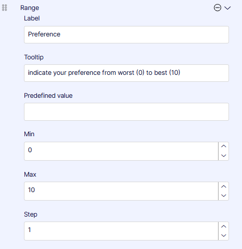
- Label – Enter the text of the label that displays on the form.
- Tooltip – Enter text to display when the visitor hovers over the field for information.
- Predefined value – Internally name or code submitted form data to distinguish the data from other data. For example, you might enter Christmas in one form and Hanukkah in another to know that the form submissions are related to a particular marketing campaign.
- Min – Use the selector to select a minimum value down to -2,147,483,648.
- Max – Use the selector to select a maximum value up to 2,147,483,647.
- Step – Select the increments (such as 2 if you want only even numbers to be entered).
Reset
Reset creates a link that clears the form contents, such as to start over or exit.
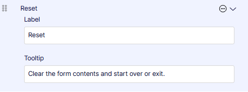
- Label – Enter the text of the label that displays on the form.
- Tooltip – Enter text to display when the visitor hovers over the field for information.
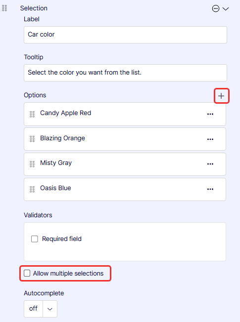
Selection
Selection creates a drop-down list with single or multiple selections. See also Choice, which creates a list of options (but not in a drop-down list).
-
Label – Enter the text of the label that displays on the form.
-
Tooltip – Enter text to display when the visitor hovers over the field for information.
-
Options – Click Add (+) to specify more options.
- Label – Enter the text to label the option.
- Value – Enter the value, which is not displayed, but you can use the value (such as 4 or chocolate; something meaningful to you) in your reports.
- Selected – Enable to make this the option selected by default. The user would have to unselect it.
-
Validators – Select Required field if you want to ensure the form data cannot be submitted unless you have it filled in. A red asterisk (*) displays next to required fields.
-
Allow multiple selections – Select to let the user select one or more of the options.
-
Autocomplete – Select the relevant option to help the user enter data.
Submit
Submit creates a link that sends form data to Optimizely CMS.
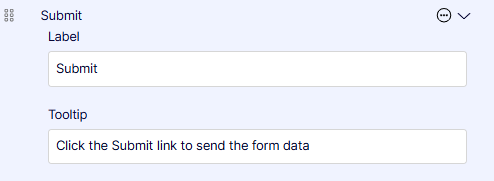
- Label – Enter the text of the label that displays on the form.
- Tooltip – Enter text to display when the visitor hovers over the field for information.
Textarea
Textarea provides a multiple-line text entry field.
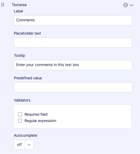
- Label – Enter the text of the label that displays on the form.
- Placeholder text – Give an example of what you want in the field. It is not recorded in the form data.
- Tooltip – Enter text to display when the visitor hovers over the field for information.
- Predefined value – Internally name or code submitted form data to distinguish the data from other data. For example, you might enter Christmas-campaign in one form and Hanukkah-campaign in another to know that the form submissions are related to a particular marketing campaign.
- Validators – Select Required field if you want to ensure the form data cannot be submitted unless you have it filled in. A red asterisk (*) displays next to required fields.
- Error message – Enter a text message to display if the field data does not comply with its restrictions.
- Email – Select to require a valid email address.
- Number – Select to allow only integers in the field.
- Regular expression – Select to allow a regular expression pattern (such as /\s*/).
- Autocomplete – Select the relevant option to help the user enter data.
Textbox
Textbox provides a single-line text entry field. You can restrict the format to email addresses, for example.
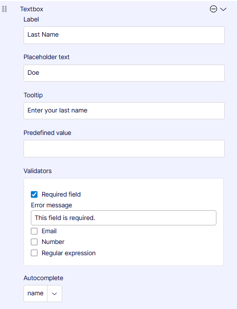
- Label – Enter the text of the label that displays on the form.
- Placeholder text – This text provides the user with an example of what you want in the field. It is not recorded in the form data.
- Tooltip – Enter text to display when the visitor hovers over the field for information.
- Predefined value – Internally name or code submitted form data to distinguish the data from other data. For example, you might enter Christmas-campaign in one form and Hanukkah-campaign in another to know that the form submissions are related to a particular marketing campaign.
- Validators – Select Required field if you want to ensure the form data cannot be submitted unless you have it filled in. A red asterisk (*) displays next to required fields.
- Error message – Enter a text message to display if the field data does not comply with its restrictions.
- Email – Select to require a valid email address.
- Number – Select to allow only integers in the field.
- Regular expression – Select to allow a regular expression pattern (such as /\s*/).
- Autocomplete – Select the relevant option to help the user enter data.
Url
Url lets a visitor specify a URL to submit with form data.
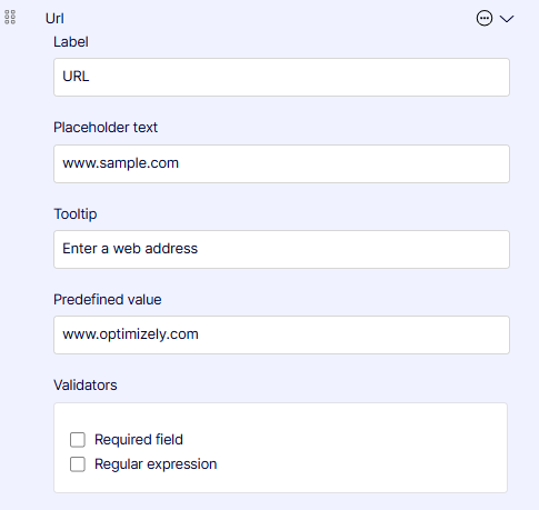
- Label – Enter the text of the label that displays on the form.
- Placeholder text – Give an example of what you want in the field. It is not recorded in the form data.
- Tooltip – Enter text to display when the visitor hovers over the field for information.
- Predefined value – Internally name or code submitted form data to distinguish the data from other data. For example, you might enter Christmas-campaign in one form and Hanukkah-campaign in another to know that the form submissions are related to a particular marketing campaign.
- Validators – Select Required field if you want to ensure the form data cannot be submitted unless you have it filled in. A red asterisk (*) displays next to required fields.
- Error message – Enter a text message to display if the field data does not comply with its restrictions.
- Email – Select to require a valid email address.
- Number – Select to allow only integers in the field.
- Regular expression – Select to allow a regular expression pattern (such as /\s*/).