Get started with Visual Builder
Visual Builder is the editor interface in Optimizely Content Management System (SaaS) that makes content creation and layout building intuitive and accessible to non-technical users.
Using Visual Builder, you can design, modify, and reuse blueprints (layout templates) directly in the Optimizely Content Management System (CMS) (SaaS) user interface. You can create adaptable experiences for any channel without developer involvement. Front-end developers can also create styles that you can pick to help you adhere to your brand's guidelines.
NoteSee an interactive demo on how to approach content modeling in Optimizely CMS (SaaS) and Visual Builder.
Visual Builder syncs content between the Outline and the Preview panels, so you see your changes immediately. See Preview an experience.
Visual Builder concepts
Visual Builder is the editor interface in CMS (SaaS) that lets developers, content managers, and content administrators collaboratively build and manage content. This section explores the key concepts of Visual Builder, providing insights into how each aspect contributes to the content creation process.
Experience
An experience is an extension of a page that accesses Visual Builder functionality. Experiences are flexible and composable web or application pages that display in a list. They consist of sections that you can save as reusable blueprints. See Create Visual Builder content from scratch and Create Visual Builder content from a blueprint.

From a developer's perspective, experiences provide access to the layout system and the UnstructuredData array. See Configure Visual Builder.
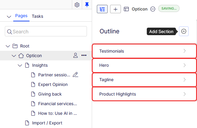
Outline
An outline is a list of your sections where you add and manage the content in your experience.
- Go to the content you want to edit by hovering over the section in the Preview or the Outline.
- Click each content to edit it.
- Control the style of the content.
- Save the content as a reusable blueprint.
- You can drag and drop a section to reorder it.

Section
A section is a visually distinct segment of your webpage; a group of content on a page. You can save sections as a reusable blueprint.
Sections use rows and columns in a grid layout to organize and arrange content. See the Grid section in the Configure Visual Builder documentation.
Element
Elements are the building blocks for creating content. As a content manager, you cannot divide elements or modify their structure because they are the smallest building blocks. You should define only unchanging structures as elements.
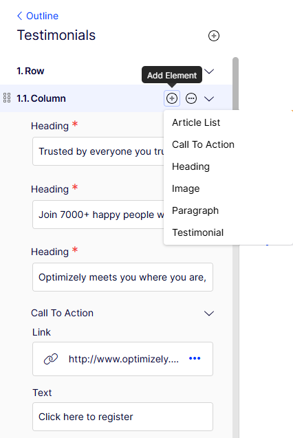
An element can be as simple as a Heading with a single text input field or more complex, like the Testimonial element with various optional and required fields with customer names, locations, pictures, and text.
Elements do not have layout controls, but you can style them.
A developer creates elements for the end user to use. For information about elements, see Content modeling.
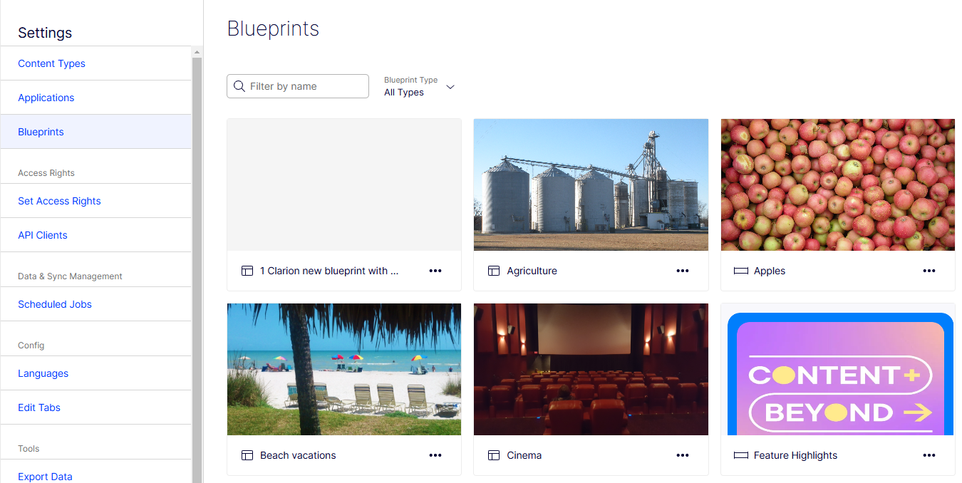
Blueprint
Blueprints are reusable layout templates that content managers can create in the user interface. You can save sections and experiences as blueprints. See Blueprints and Save as blueprint.
Style
Style settings let you modify the appearance of the content based on pre-approved guidelines. You can apply style to any level of Visual Builder content such as elements, rows and columns, sections, or experiences. See Select styles.
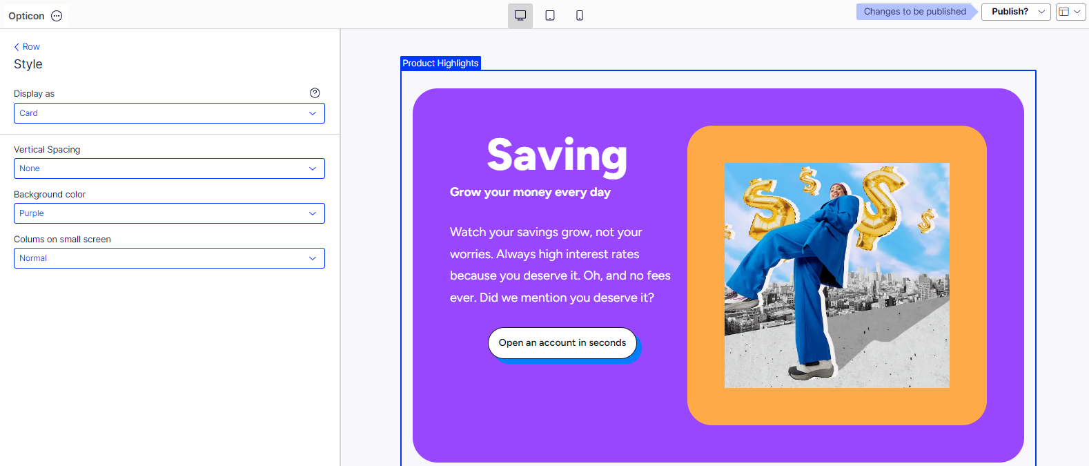
See Configure Visual Builder for information about creating styles in Visual Builder.
Troubleshoot Visual Builder
The live preview unexpectedly stopped and displayed 404 errors
Visual Builder may encounter a 404 (not found) error if it attempts to access a page or content item that is not properly synced or indexed with Optimizely Graph. Optimizely Graph fetches and manages content. This issue can arise if a page is newly created, modified, following a deployment, or if a sync job failed, resulting in Optimizely Graph being unable to locate the content at the specified path. To address this:
-
Verify that live preview settings are enabled – Go to Settings > Applications and select an application to open its settings. Select Live Preview tab, select Use Preview Tokens, select Enabled, and click Save. Selecting these options lets Optimizely generate preview URLs and pass tokens for Visual Builder to access draft content and private resources. Without these settings, the editor cannot load the content, even if it is in Optimizely Graph.
-
Sync Optimizely Graph – Go to Settings > Scheduled Jobs, and run Optimizely Graph Full Synchronization.