Create a form
Create a form in CMS (SaaS) Visual Builder
Forms in Optimizely CMS (SaaS) are built as shared blocks that contain form elements such as text inputs, drop-down lists, and a submit element. The following steps describe how to create a page that hosts the form and the shared block that holds the form fields.
-
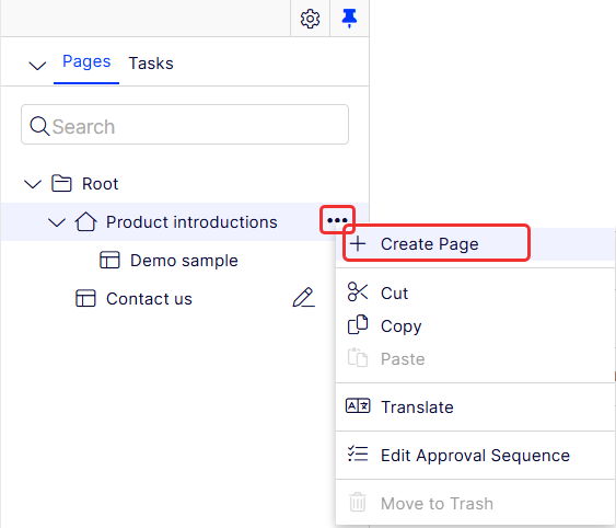
Select More > Create Page from the page tree. The Create Page window displays.
-
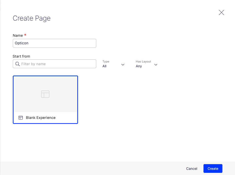
Enter a name (Opticon), select Blank Experience (or other template), and click Create.
-
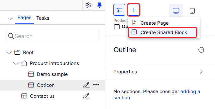
Select Add > Create Shared Block. The Create Shared Block window displays.
-
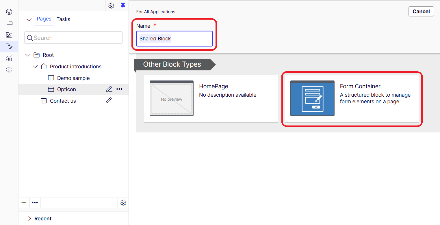
Enter a name for the block (Register for Opticon) and select the Form container data block. The block displays in the Shared Blocks list in the For All Applications folder.
-
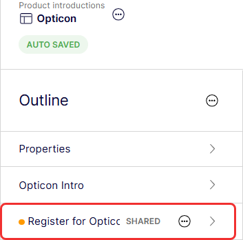
Search for your block by entering text in the search field. Drag your block to the outline.
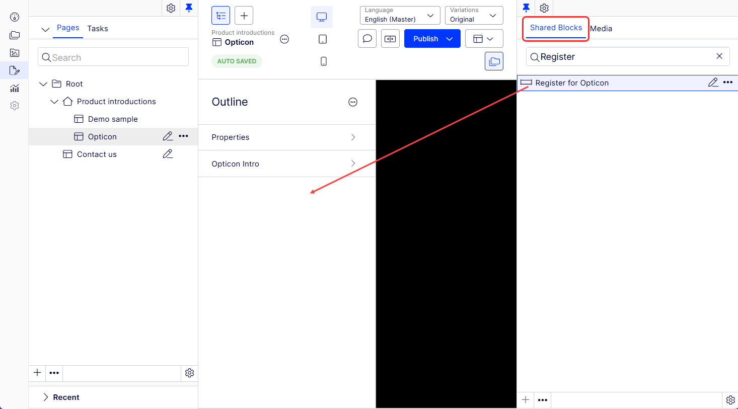
The block displays in the outline.
-
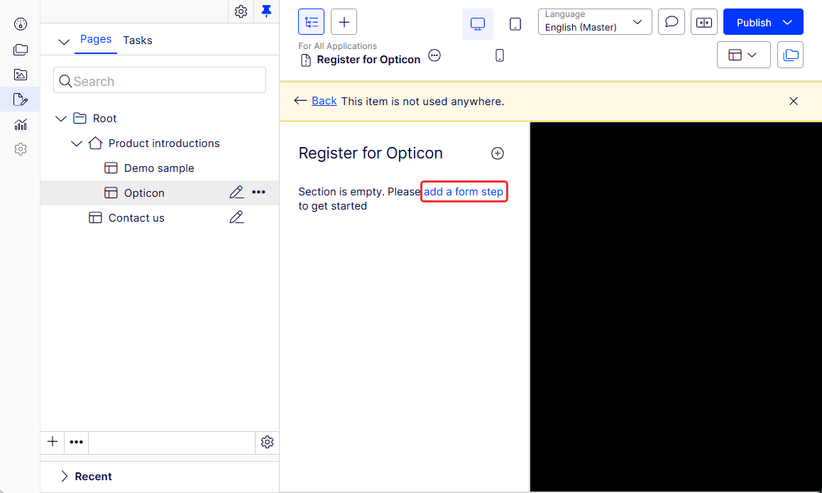
Click in the outline and click Add a form step to start your form.
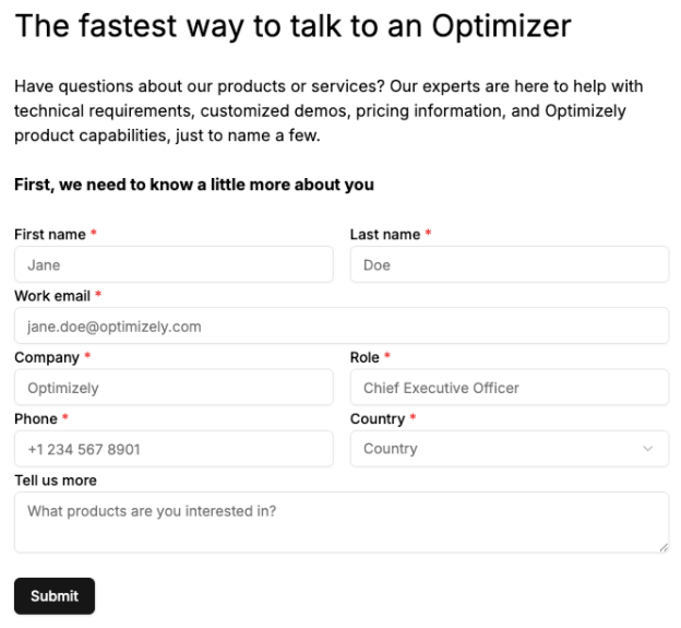
This example creates a form with six rows and the following information:
- Row 1 – Two columns; First name (Textbox) and Last name (Textbox)
- Row 2 – One column; Work email (Textbox)
- Row 3 – Two columns; Company (Textbox) and Role (Textbox)
- Row 4 – Two columns; Phone (Textbox) and Country (Textbox)
- Row 5 – One column; Tell us more (Textarea)
- Row 6 – One column; Submit (Submit)
The completed form should look similar to this:
-
Select Add Row in Form Step.
-
Select Add Column in Row. Select Add Column again to put two columns in the row.
-
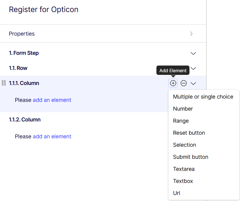
Select Add Element > Textbox in Column.
-
Click the Textbox and enter the data. Visual Builder dynamically builds the form as you enter data.
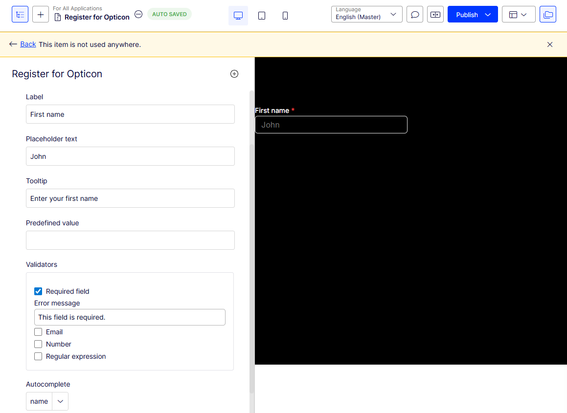
- Label – Enter the text of the label that displays on the form.
- Placeholder text – Give an example of what you want in the field. It is not recorded in the form data.
- Tooltip – Enter the text you want to display when the user hovers over the field to provide added information.
- Predefined value – Internally name or code submitted form data to distinguish the data from other data. For example, you might enter Christmas-campaign in one form and Hanukkah-campaign in another to know that the form submissions are related to a particular marketing campaign.
- Validators – Select Required field if you want to ensure the form data cannot be submitted unless you have it filled in. A red asterisk (*) displays next to required fields.
- Error message – Enter a text message to display if the field data does not comply with its restrictions.
- Email – Select to require a valid email address.
- Number – Select to allow only integers in the field.
- Regular expression – Select to allow a regular expression pattern (such as /\s*/).
- Autocomplete – Select the relevant option to help the user enter data.
-
Repeat Step 10 for the next column (1.1.2) and enter the Last name Textbox data. Continue to build the form for Work email, Company, Job title, and Phone with Textbox.
-
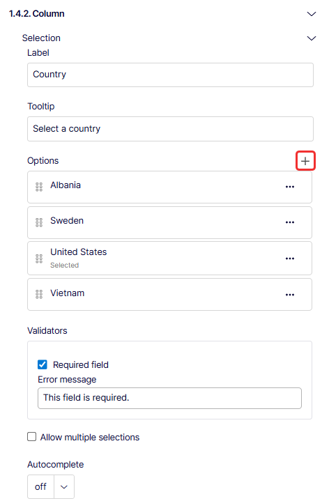
Click Add to specify options for the user to select for the Country field (column 1.4.2).
Note
- The Message field (column 1.5.1.) has a Textarea element instead of a Textbox element to let the user enter as much text as they need.
- The Submit field (column 1.6.1) has a Submit element which creates a link for the user to send the form data.