Form elements
Describes how to configure form elements that may require input from users in Connect Platform for Optimizely Data Platform (ODP).
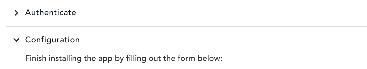
A form can have one or more sections allowing you to organize input required from the user, such as having a section just for authentication and a separate section for configuration. For example:
sections:
  - key: auth
    label: Authenticate
    properties:
      - authorized
    elements:
      - ...
  - key: config
    label: Configuration
    disabled:
      key: auth.authorized
      equals: false
    elements:
      - type: instructions
        text: Finish installing the app by filling out the form below:
      - ...
Sections are accordions where users can only open/interact with one section at a time. The example above displays the following sections on the app's Settings tab in the ODP App Directory:
Form element attributes
All form elements include the following base attributes:
type– The element type (for example,toggle,text,secret, and so on).visible– (Optional) A predicate that determines whether or not to show the element.
All input elements include the following attributes:
type– The element type (for example, toggle, text, secret, and so on).key– A unique identifier used to access the data associated with this form field.label– The label that displays above the field.help– An explanation of the input value or instructions to help the user complete the form.defaultValue– (Optional) The default value if the user has not edited the field.required– (Optional) A predicate that, if evaluated totrue, requires the field not to be empty before the user can submit the form.validations– (Optional) A list of form validations that the app must perform before the user submits the form.disabled– (Optional) A predicate that determines whether or not the element should display disabled (and be non-interactable).readonly– (Optional) A predicate that determines whether or not to display the element.
You can dynamically show/hide any form element and can also dynamically disable or require any input depending on the state of the entire form using predicates. You can also use predicates in validations to reduce the amount of logic you need for your app to process the form.
Form element types
Each form section must have one or more of the following element types:
Toggle
type: toggle
A switch to turn an option on or off. This results in a boolean value. For example:
- type: toggle
  key: mms
  label: MMS
  help: Send an image along with the message.  Additional messaging rates may apply.
- type: toggle
  key: shortenLinks
  defaultValue: true
  label: Shorten links and enable click tracking
  help: Shorten links to reduce message character counts and record click activity when links are followed.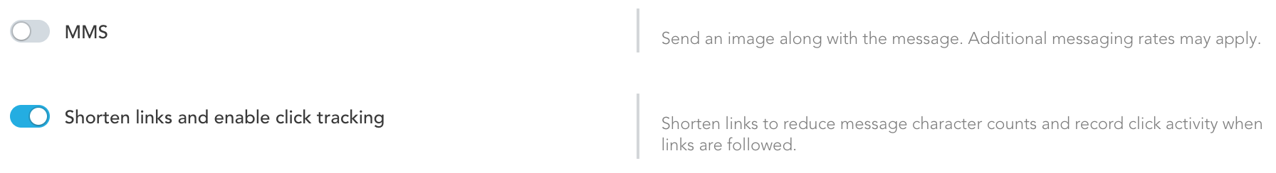
Text input
type: text
Allows input of plain text, configurable as a single or multi-line input. For example:
- type: text
  key: message
  label: Message
  multiline: true
  help: The SMS message to deliver. Aim to stay under 140 characters for optimal formatting on mobile devices. Messages longer than 70 characters may be split into multiple messages.
  required: true
- type: text
  key: image
  label: Image URL (optional)
  help: The URL of an image to send along with the message. The URL must be publicly accessible and the image size must be **less than 525KB**.
  required: true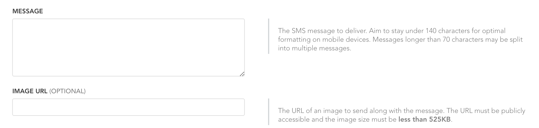
Additional attributes fortext elements
dataType– (Optional) The preferred input data type if supported by the browser. Allowed values:text,number,email,phone.hint– (Optional) Hint text that displays to the user until they make a selection. Only applicable toselectdisplay mode.multiline– (Optional) Set totrueif the text input should allow multiple lines of text. Otherwise, set tofalseor do not include.
Secret
type: secret
Allows sensitive text input. Hides input as the user types, and when they save it, displays the input as asterisks to keep the data protected. The user cannot access the original value after submitting the form. For example:
- type: secret
  key: client_secret
  label: Client Secret
  help: Get your [Client Secret](https://support.vendor.com/s/article?article=API-Getting-Started&language=en_US) from Vendor
Additional attributes forsecret elements
hint– (Optional) Hint text that displays to the user until they make a selection. Only applicable toselectdisplay mode.
Select
type: select
Displays multiple selectable options as either a toggle, radio buttons, or a drop-down list depending on the number of options:
- If there is only 1 option, Connect Platform for ODP displays a
switch, which is like a toggle. - If there 2 or 3 options, Connect Platform for ODP displays radio buttons.
- If there are 4 or more options, Connect Platform for ODP displays a drop-down list.
NoteIf the data source is remote, Connect Platform for ODP always displays a drop-down list.
For example, to display radio buttons:
- type: select
  key: resync_day
  label: Re-sync Day
  help: Choose a day of the week to re-sync your attributes
  options:
    - text: Monday
      value: 1
    - text: Wednesday
      value: 3
    - text: Friday
      value: 5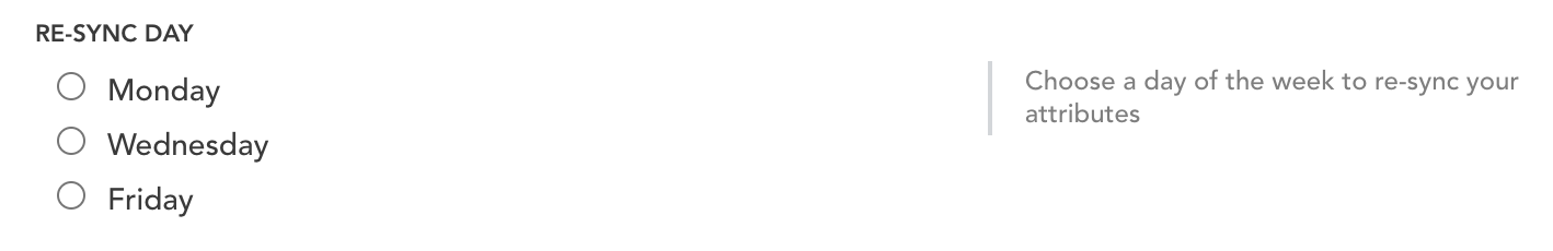
To display a drop-down list:
- type: select
  key: advertiser_id
  label: Advertiser ID
  help: Choose the advertiser in your portfolio to sync to
  dataSource:
    type: app
    function: vendor_portfolio
  disabled:
    key: auth.authConfirmed
    equals: false
Additional attributes forselect elements
display– (Optional) The preferred display format for the select element. Allowed values:auto,radio, orselect.options– (Optional) A hard-coded list of options you can display to the user in the form of objects containingtextandvalue(see example above).dataSource– (Optional) For dynamic select options, specify a data source instead of options. Supportshttporappas the source type. See remote select options for allowed values and implementation.hint– (Optional) Hint text that displays to the user until they make a selection. Only applicable toselectdisplay mode.
Multi-select
type: multi_select
Allows the user to choose one or more options from a set of switches (like toggles) or a multi-select drop-down list, depending on the number of options:
- If there are more than 3 options, Connect Platform for ODP displays switches (which are like toggles).
- If there are 4 or more options, Connect Platform for ODP displays a multi-select drop-down list.
For example:
- type: multi_select
  key: fields
  label: Fields to Sync
  help: Select the fields you want to sync from ODP. Selecting a new field will require clicking save for that field to start sending. Removing a field from the list will NOT delete the data in your Vendor
  dataSource:
    type: app
    function: get_odp_field_options
  defaultValue:
    - insights.order_likelihood
    - insights.ttno_days
    - observations.discount_usage
    - observations.average_order_revenue
    - observations.order_revenue_percentile
    - observations.total_revenue
    - observations.total_revenue_percentile
    - observations.order_count
    - observations.order_count_percentile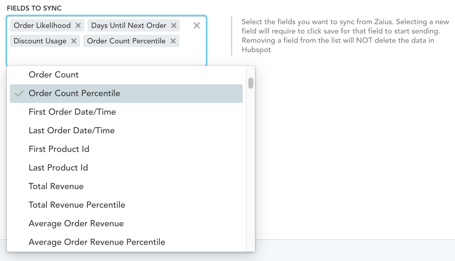
Additional attributes formulti-select elements
display– (Optional) The preferred display format for the select element. Allowed values:auto,checkbox,select.options– (Optional) A hard-coded list of options you can display to the user in the form of objects containingtextandvalue(see example above).dataSource– (Optional) For dynamic select options, specify a data source instead of options. Supportshttporappas the source type. See remote select options for allowed values and implementation.hint– (Optional) Hint text that displays to the user until they make a selection. Only applicable toselectdisplay mode.
Button
type: button
Allows the user to perform an action by clicking the button. Each section that contains form data must have at least one submit style button. You can also use buttons to link to external sites when the user should perform an action outside the app's Settings tab in the ODP App Directory. For example:
- type: button
  label: Save
  action: save
  style: primary
- type: button
  label: Start Sync
  action: sync
  disabled:
    key: fieldsSaved
    equals: false
Additional attributes forbutton elements
action– A string value representing the action this button performs, which the app handles using the (onFormSubmit)[doc:ocpcoreconcepts-processing-forms#settings-form] handler (is not displayed to the user).style– (Optional) The style of the button:primary,none(default),danger.
Link button
type: link_button
A button that opens a URL in a new tab instead of submitting a form, which can be useful for directing the user to a settings page in the third-party product that the app is integrating with. For example:
- type: link_button
  label: Begin Integration
  help: Creating a new integration in your Vendor
  style: primary
  href: https://{{{setup.store_domain}}}/integrations/new
Additional attributes forlink_button elements
href– A URL to the page you want to open in a new tab. Usehttpswhen possible. Supports Mustache substitutions.style– (Optional) The style of the button:primary,none(default),danger.
OAuth button
type: oauth_button
A button that opens a URL in a new tab instead of submitting a form, which is useful for directing the user to a settings page in the third-party product that the app is integrating with. For example:
- type: oauth_button
  label: Authorize
  help: Creating a new integration in your Vendor
  style: primary
  href: https://{{{setup.store_domain}}}/integrations/new
Divider
type: divider
Visually separates a set of elements. For example:
- type: dividerThis displays the following line between form elements:

Instructions
type: instructions
A markdown formatted text paragraph you can add to the form to provide the user with detailed instructions or information. Use markdown to add links and images. For example:
- type: instructions
text:
Visit your Vendors settings page ([https://app.vendor.com/settings](https://app.vendor.com/settings)) and paste the URL above in the Webhook URL field.
Once you save the Webhook URL, ODP will start receiving future Vendor data as it happens. 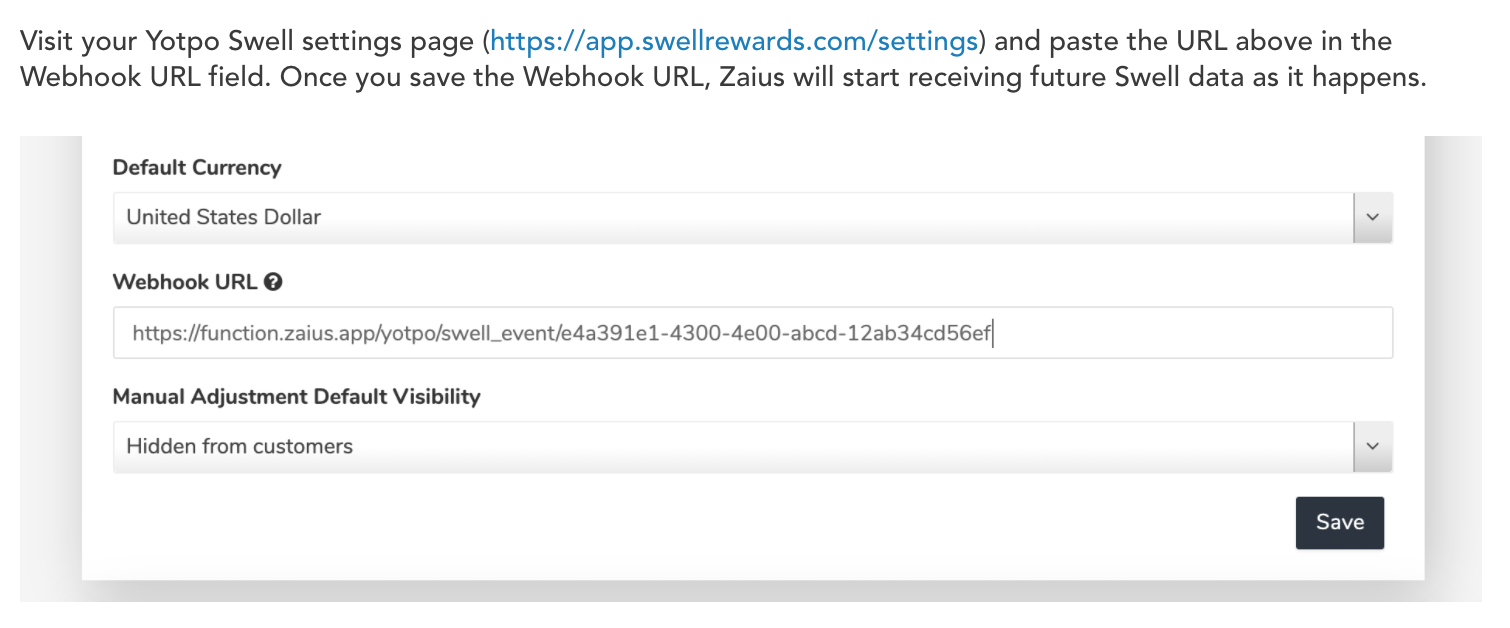
Updated 5 days ago