Form basics
Create user-facing forms for apps in Connect Platform for Optimizely Data Platform (ODP).
NoteForms are only available for hosted apps.
Create user-facing forms, such as the app settings forms, from a YAML definition. You define the fields, buttons, drop-down lists, rules for when to display/hide certain fields, field validation, and so on, and Connect Platform for Optimizely Data Platform (ODP) generates and displays the form to app users.
App settings forms are divided into sections, where users view and complete one section at a time but can switch between the sections as desired. Sections contain one or more form elements or input fields. Each field has a number of required properties:
type– Which form element you want to display on the form.key– Use to store and reference values when loading, saving, or interacting with a form.label– A visible label next to the field when the form is rendered.help– Additional context you can provide to the user when they hover their cursor over a help icon.
Create a settings form
All apps need a settings form, whether to display instructions to the user or to collect information such as credentials and configuration options. Your settings form is defined in the src/forms/settings.yml file. If you initialized your app using the Connect Platform for ODP command-line interface (CLI), you have a placeholder form.
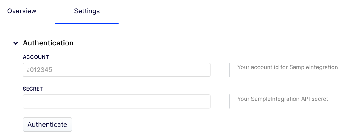
A simple authentication form might look like the following:
sections:
- key: auth
  label: Authentication
  elements:
  - type: text
    key: login
    label: Account
    help: Your account id for SampleIntegration
    hint: a012345 or [email protected]
  - type: secret
    key: secret
    label: Secret
    help: Your SampleIntegration API secret
  - type: button
    label: Authenticate
    action: submit
This example form displays an Account text box for account entry, a Secret password field for the secret entry, and an Authenticate button that the user clicks to submit the form data.
Validate user data
The form definition can automate data validation. The simplest way to ensure the user enters valid data into your form is to add regular expression (regex) validations. All fields support a list of regex validations, so you can add one or more validations, each with their own error message. For example:
  elements:
  - type: text
    key: login
    label: Login
    help: Your login details for SampleIntegration
    hint: a012345 or [email protected]
    required: true
    validations:
    - regex: "^a\\d+$|^.+@.+\\..{2,}$"
      message: Please enter a valid account id or email address.
In this case, if the user leaves the account ID field blank, when they attempt to save/submit the form, a message indicating the field is required is displayed below the field (required: true). If the entered value does not look like regex: "^a\\d+$|^.+@.+\\..{2,}$", then a message explaining what the account ID should look like is displayed. You can define multiple validations which are evaluated in order and all failing validation messages are displayed.
Validations can be more complicated and reference data in other sections of the form. For more advanced use cases, see Form Validation.
Disable/hide fields, buttons, and sections
You can display or hide any form element, including fields and buttons using the disabled or visible properties. This allows you to manage the user flow of setting up the integration with your app. For example, the following form has a Login text field and two different secret fields, depending on what type of authentication the user needs:
sections:
- key: auth
  label: Authentication
  elements:
  - type: text
    key: login
    label: Login
    help: Your login details for SampleIntegration
    hint: a012345 or [email protected]
    required: true
    validations:
    - regex: "^a\\d+$|^.+@.+\\..{2,}$"
      message: Please enter a valid account id or email address.
  - type: secret
    key: passcode
    label: Passcode
    help: A one time passcode generated by SampleIntegration
    visible:
      key: auth.login
      regex: "^.+@.+\\..{2,}$"
  - type: secret
    key: secret
    label: API Secret
    help: Your Sample Integration API secret
    visible:
      key: auth.login
      regex: "^a\\d+$"
  - type: button
    label: Authenticate
    action: submit
    disabled:
      operation: any
      comparators:
      - key: auth.login
        empty: true
If the user completes the Login field with an account ID, such as a012345, the API Secret field becomes visible as soon as the regex matches an account ID (it does not wait for the user to submit the form).
Alternatively, if the user enters their email address for the Login field, the Passcode field becomes visible.
Finally, the Authenticate button to submit the form is disabled until the user types anything into the Login field. This way, the user can type an invalid login value, submit the form, and receive errors directing them to enter a valid account ID or email.
For more information, see Advanced predicates.
Insert dynamic content
In addition to dynamically showing and hiding sections and elements, you can insert dynamic values into certain visible attributes of your form elements using the Mustache templating language. This means you can display a code or change a URL in the content you display to the user depending on what form data they have submitted or dynamic properties set by your app.
The following form element attributes support Mustache templating: label, help, text, and href.
sections:
- key: setup
  label: Setup
  elements:
  - type: text
  - key: store_domain
    label: Store Domain
    help: The domain of your Magento store
  - type: instructions
    text: |
      You will need to enable this app as an Integration in your [Magento Admin](https://{{{setup.store_domain}}}/admin).
      Use the following options to configure the integration:
      - Name: `OCP Product Sync`
      - Email: `[email protected]`
      - Callback URL: `{{{setup.callback_url}}}`
      - Identity link URL: `https://app.zaius.com`
  - type: link_button
    label: Begin Integration
    help: Creating a new integration in Magento
    style: primary
    href: https://{{{setup.store_domain}}}/integrations/new
NoteWhen using Mustache templating, you must reference the data as
<section_key>.<field_key>(for example,setup.store_domain) regardless of which section you are in.
Updated 5 days ago